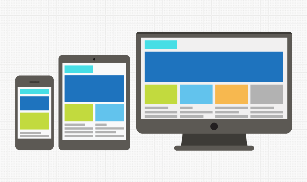
This is where responsive web design comes into play. A company needs a website that will not only work on all the devices that are currently on the market, but also the ones which will be coming out the following year, and the responsive method of design helps to achieve that. Of course, we cannot see into the future and technology changes rapidly, but with responsive design you can help to safeguard against your site becoming obsolete.
Here at Union 10 Design we believe in only developing websites that are designed to be responsive from the ground up.
Why do i need my website to be responsive?
In the long run you want your website to reach the widest audience possible, and the customers to have the good user experience on your website. This will help bring you more visitors to the site, keep them there longer and make a decision to buy a product or services from you.
Another benefit of having a mobile-friendly website is that Google knows if a person is searching from a mobile device and therefore prioritises its search results, ranking mobile-optimised sites higher than those that are not.
Viewing a web page on a mobile and tablet device is growing like crazy, and in some cases it’s the only way people view the internet. A BBC article in 2012 stated:
42% of these now say their smartphone is the most important device for accessing the internet, with 42% regularly using social networking sites and 51% using e-mail. Source: BBC
So if that’s the case, what will the percentage be now. A newer survey showed:
Over half (53%) of UK adults are now media multi-tasking while watching TV on a weekly basis. Watching other content on a different device is one of these activities. Source: Ofcom
If you still need some convincing look at the facts shown below
- Over 1.2 billion people access the web from their mobile devices. Source: Trinity Digital Marketing
- Global mobile traffic now accounts for 15% of all Internet traffic. Source: Internet Trends 2013
- 61% of people have a better opinion of brands when they offer a good mobile experience. Source: Latitude
- 60% of mobile shoppers use their smartphones while in a store, and another 50% while on their way to a store. Source: Deloitte Digital
- 90% of people move between devices to accomplish a goal, whether that’s on smartphones, PCs, tablets or TV. Source: Google
- Almost half a billion tablets will ship in 2013 and 2014 alone. Source: Gartner
- Tablet users spend 50% more than PC users. Source: Adobe
- 25.85% of all emails are opened on mobile phones, and 10.16% are opened on tablets. Source: Knotice
- Mobile-based searches make up one quarter of all searches. Source: The Search Agency
- 95% of smartphone users have searched for local info. Source: Google
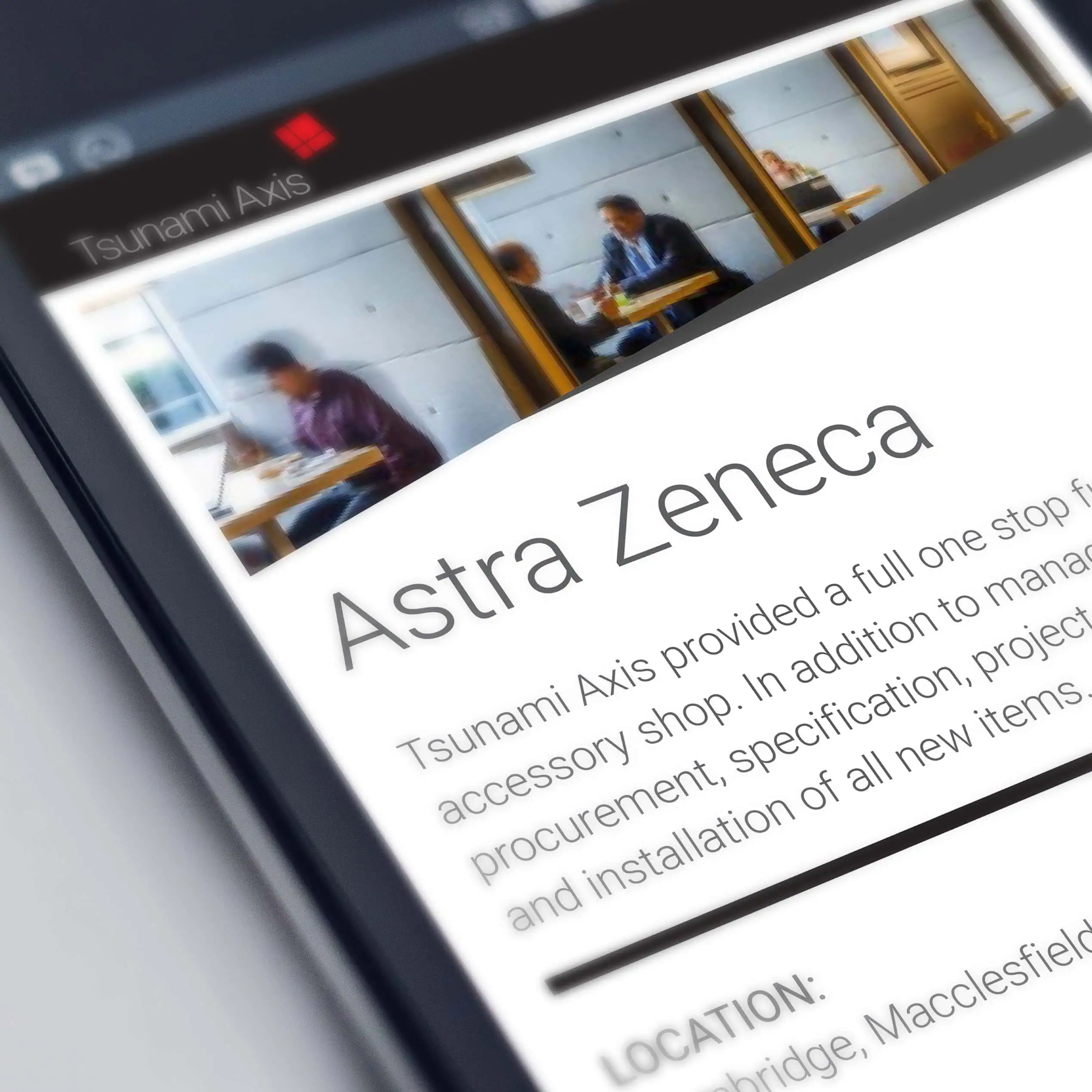
Take a look at some of the responsive websites we have built for our client here and try resizing the browser to see how the layout adapts to the different browser sizes.
Don’t get left behind with a website that cannot be viewed in today’s expanding digital market, you will lose sales and traffic on your website. Our philosophy is always to build websites that are responsive, so get in touch with us to see how we can help you build a website that’s future-proof.