Shop branding for Blue Otter Wines

Shopping around: the right brand identity for an indie retailer

Client: Blue Otter Wines

Completed: August 2015

Close-up of Blue Otter Wines lettering on a wooden sign
Illustrated otter character holding a glass of red wine
Close-up of Blue Otter Wines lettering on a wooden sign
Blue Otter Wines wordmark on a textured background
Hand-drawn otter mascot pointing, wearing a hat and waistcoat
Blue Otter Wines wordmark on a textured background

Insight

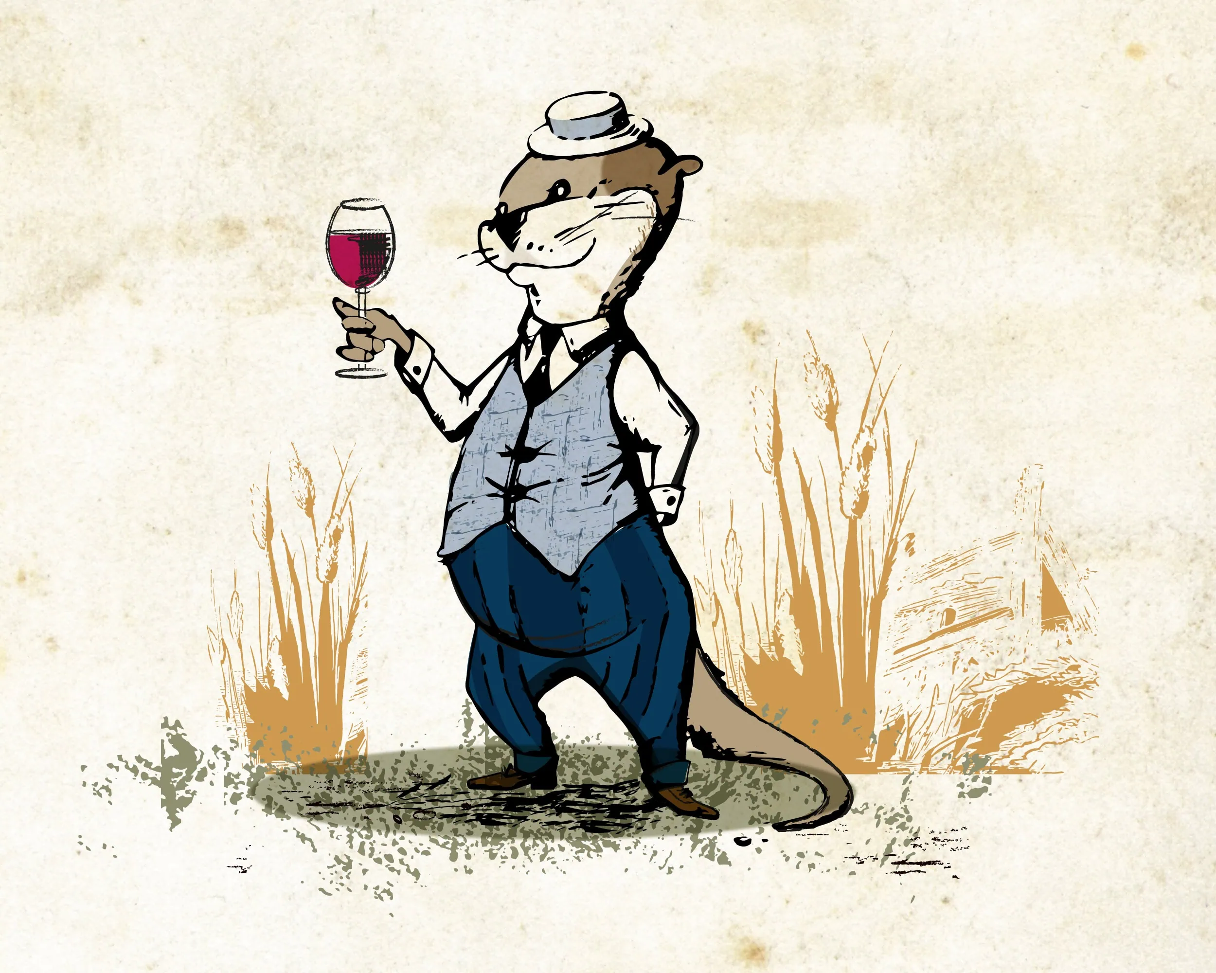
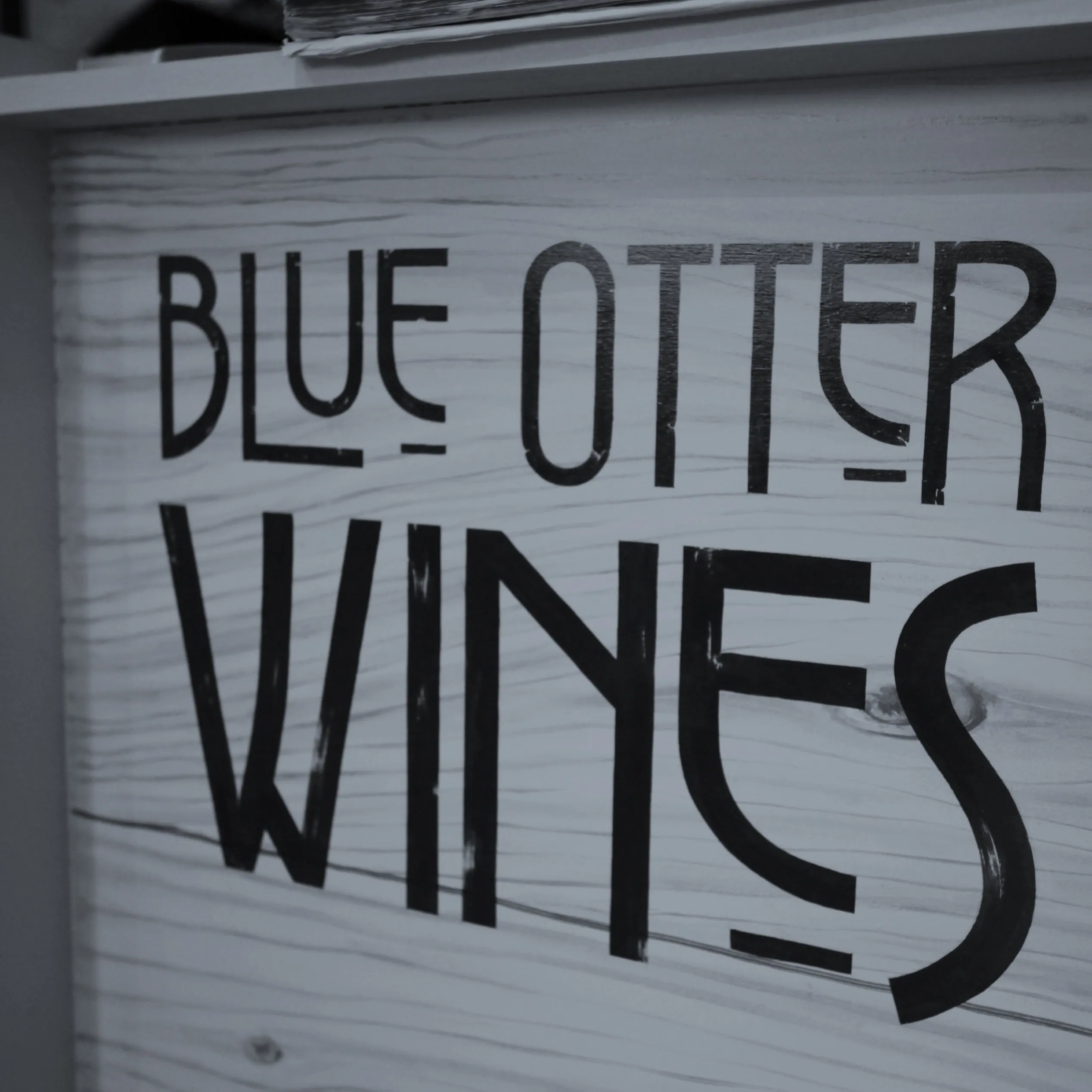
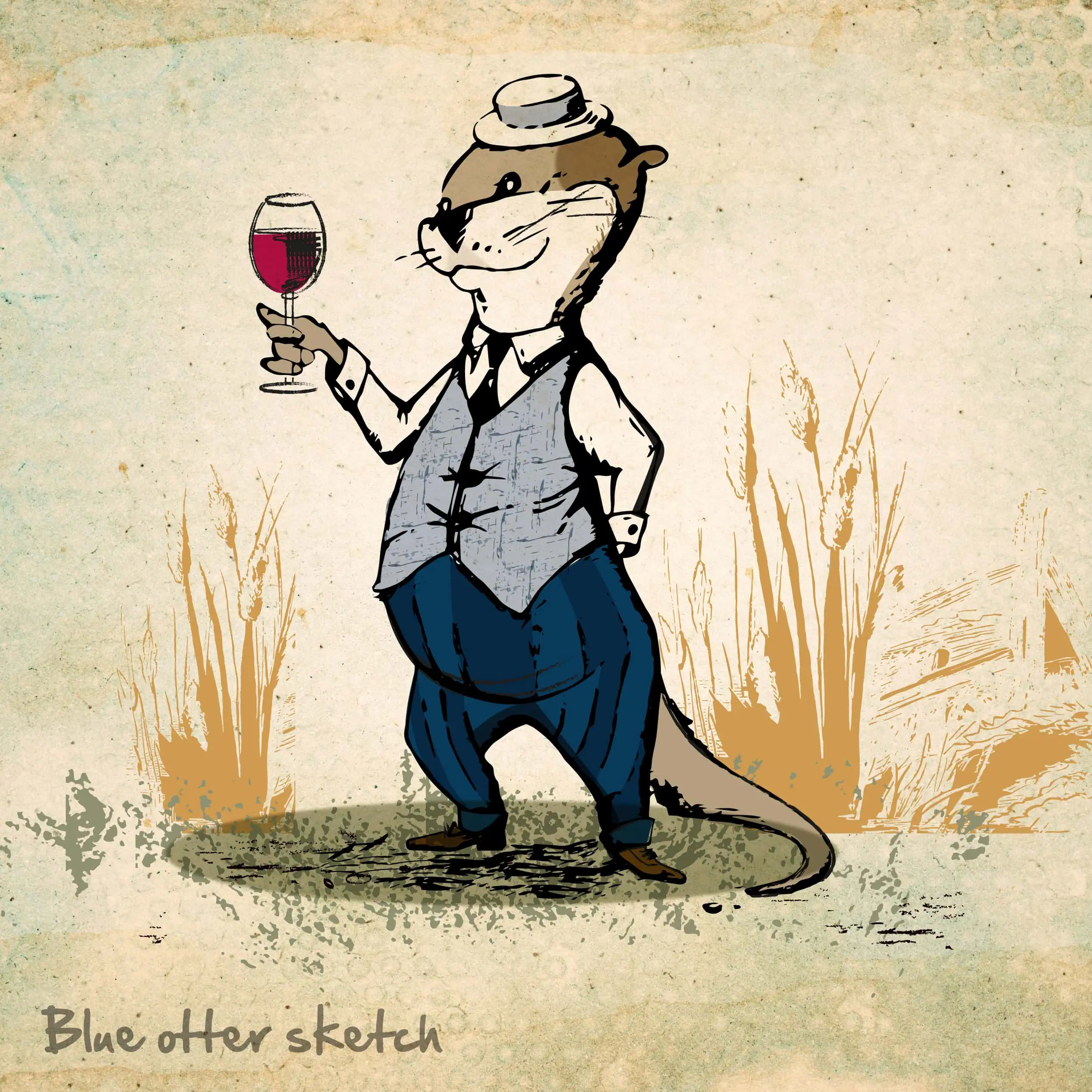
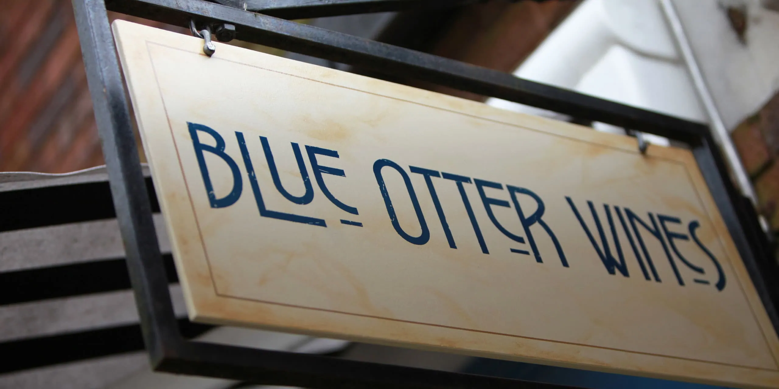
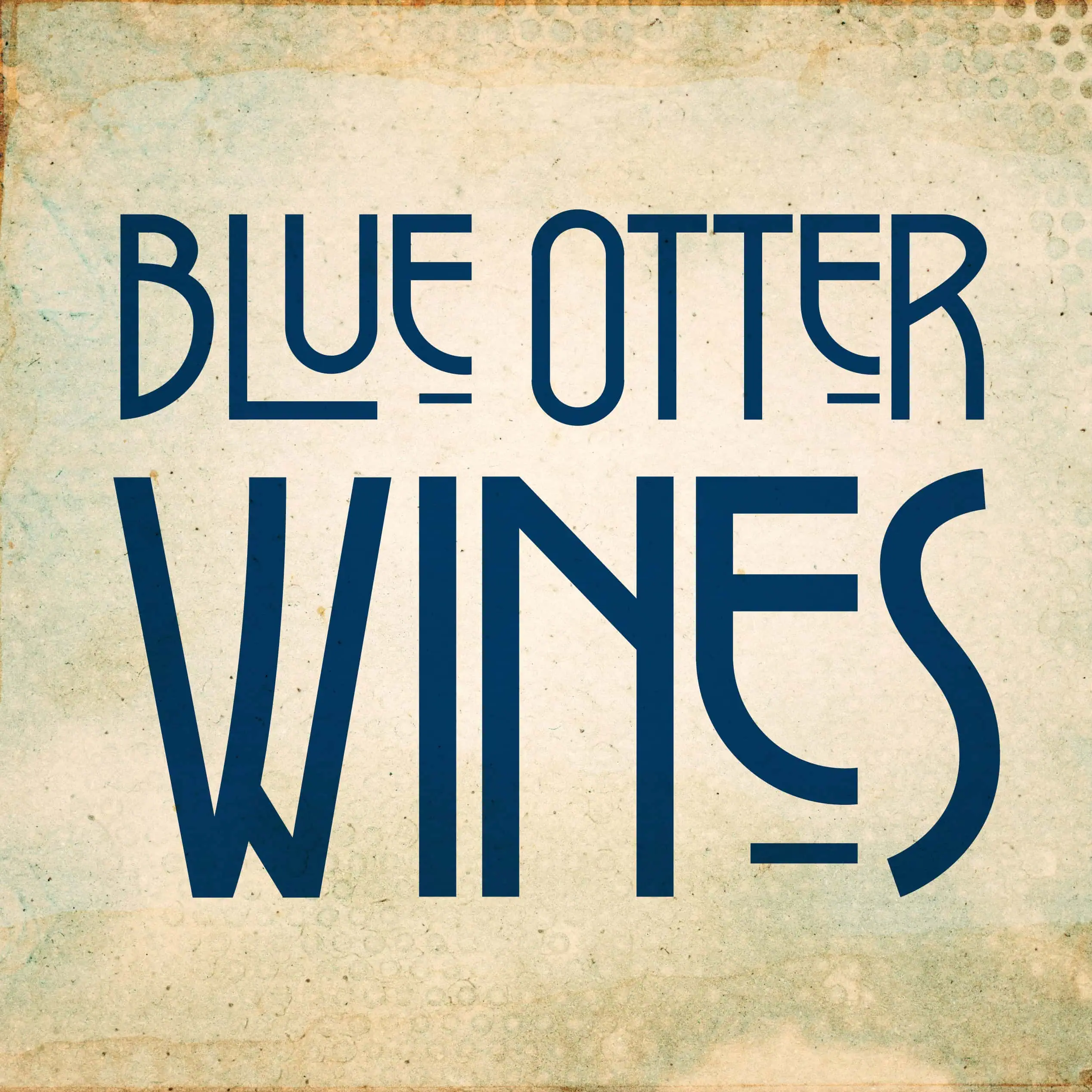
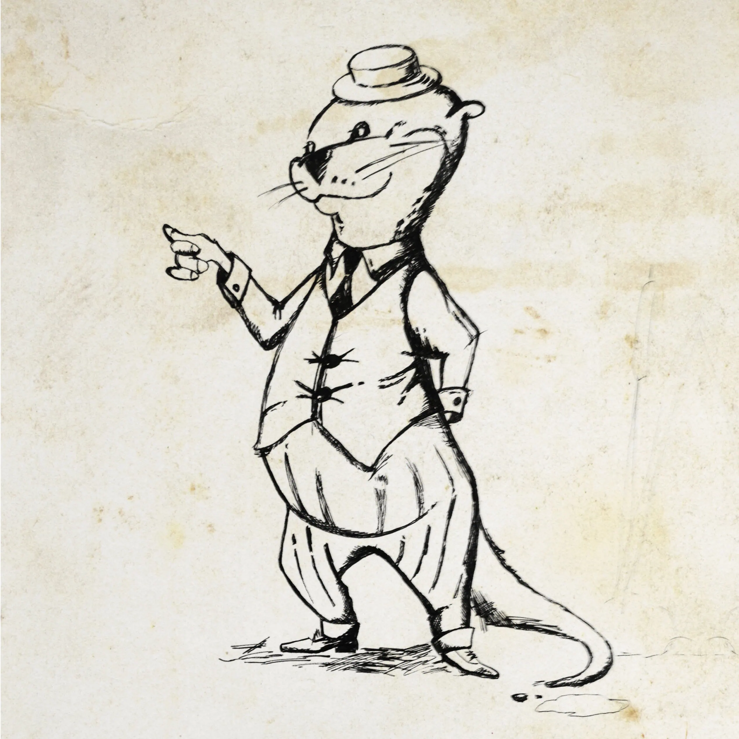
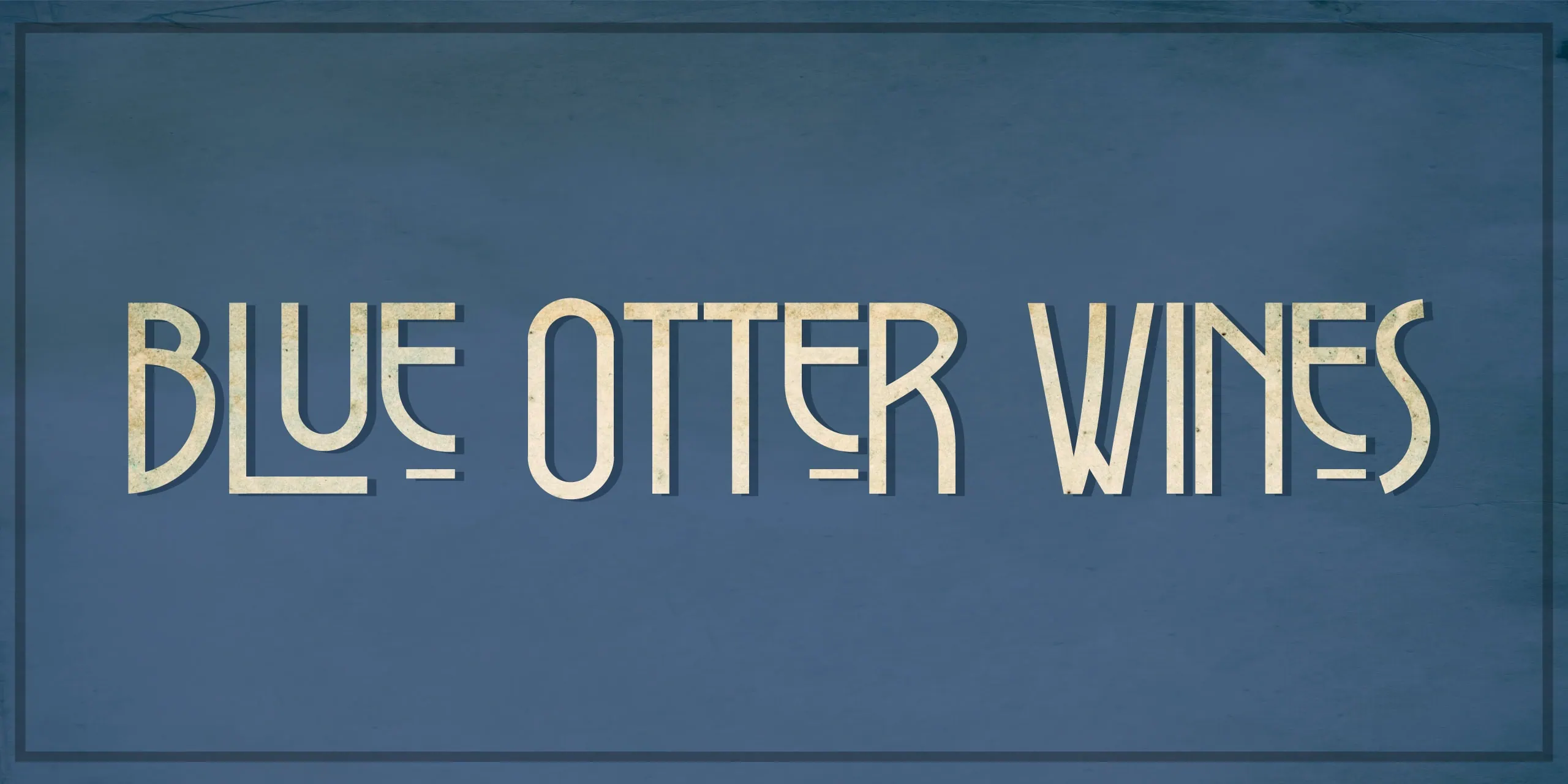
Blue Otter Wines is an independent retailer in Hitchin, Hertfordshire, specialising in fine and rare wines — alongside a carefully curated selection of spirits and craft beers. They needed their brand to better reflect the quality on the shelves, and to feel as specialist as the advice they give in-store.

We created shop branding that defined and repositioned Blue Otter across every key customer touchpoint — from the high street frontage through to digital and print.

Shop branding

We began by rebranding Blue Otter Wines, developing a new identity that felt premium, confident and rooted in tradition — without tipping into stuffy. The challenge was to appeal to fine wine buyers looking for rarity and quality, while still welcoming customers browsing craft beer, whisky or a brilliant bottle for the weekend.

For the logo, we leaned into a vintage, classic look with a quintessentially English feel. We selected typography inspired by Art Nouveau styling — echoing the American Horror Story references the client loved — to create something characterful, distinctive and ownable.

To make rollout simple and consistent, we also produced clear brand guidelines so the Blue Otter Wines identity could evolve with confidence over time.

Character illustration

Adding character

To give the brand more warmth and storytelling, we illustrated a ‘Blue Otter’ character, inspired by The Wind in the Willows and E.H. Shepard’s iconic drawings. This character became central to the identity — adding personality, charm and a recognisable focal point that customers could connect with.

With the new identity in place, we translated the concept into standout shop branding that made the store feel more purposeful and more memorable from the pavement.

High street presence

Working closely with the client and a professional signwriter, we redesigned both the exterior and interior to create a more engaging retail experience. Key elements included new signage and an in-store mural featuring our Blue Otter character — helping the shop feel curated, specialist, and unmistakably “Blue Otter”.

Web design and development

To extend the new look beyond the shop, we designed and built a clean, responsive website that captured the same bespoke, vintage feel created through the shop branding.

As with all our builds, the site was developed in WordPress, giving the client a user-friendly CMS that’s straightforward to manage, with a build that stays streamlined for speed and performance.

Expanding the brand

The refreshed high street presence helped increase footfall in the shop almost immediately. Building on that momentum, we extended the brand into social media, and designed brochures and business stationery to support face-to-face promotion and day-to-day trading.

We love working with independent retailers — it’s always rewarding to see thoughtful design (and strong shop branding) make a real difference.

Written by Jane Comar + Reviewed by James Hofton

Last updated: January 14, 2026

Get in touch


Talk to us about your next project. We’d love to hear from you.