Cella came to us needing everything at once: brand, website, copywriting and search. The branding came first and set the design style for the site. The keyword and AI search research set the structure and the sitemap. Two different starting points that met in the middle because one team was managing both.
Cella Software
B2B branding, website design and SEO for enterprise software company Cella Software
Client: Cella Software
Completed: August 2026
Sector: Enterprise software and data management
Deliverables: Branding, tone of voice, WordPress, SEO, copywriting, white papers, hosting
Relationship: Ongoing – hosting and support




Insight
Four disciplines, one team
Cella Software came to us for their brand and their website. The copy and the search strategy came with it. Normally that means a brand agency, a build team and an SEO consultant who’ve never met. Cella got one team – so the search work shaped the site instead of being bolted on afterwards.
Here’s what they do. Cella makes a legacy application data management platform. In plain English: when a big organisation switches off an old system, Cella pulls the data out and keeps it searchable, reportable and compliant, so the old system can go without anything being lost.
The track record is substantial: more than 600 systems retired for over 50 enterprises, much of it delivered through implementation partners. But a buyer meets the brand and the website first. Cella needed an identity that explained the product rather than decorating it, a site with the restraint enterprise buyers expect, and a search strategy built for a market where most people use “data archiving” and “system decommissioning” to mean the same thing. They don’t mean the same thing, and the difference is worth a great deal of money.

Branding
An identity that explains the product
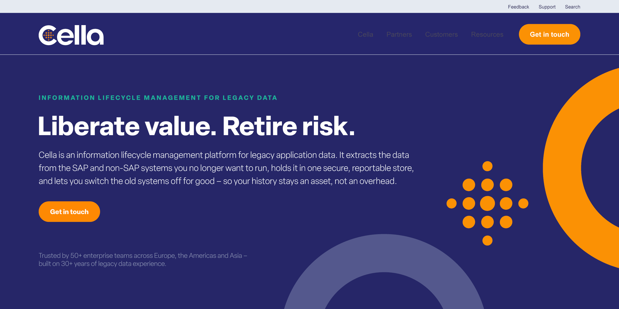
Cella’s customers are some of the largest enterprises in Europe, the US and Asia, so the new identity had to look like it belonged alongside them – credible before anyone reads a word. We delivered a new logo and a complete brand identity behind it.
The name does a lot of work. A cella is the inner chamber of a Greek or Roman temple: a windowless room with a single opening, where the treasury was kept – offerings, precious stones, war trophies. Access was restricted rather than sealed, with priests and temple guards able to go in.
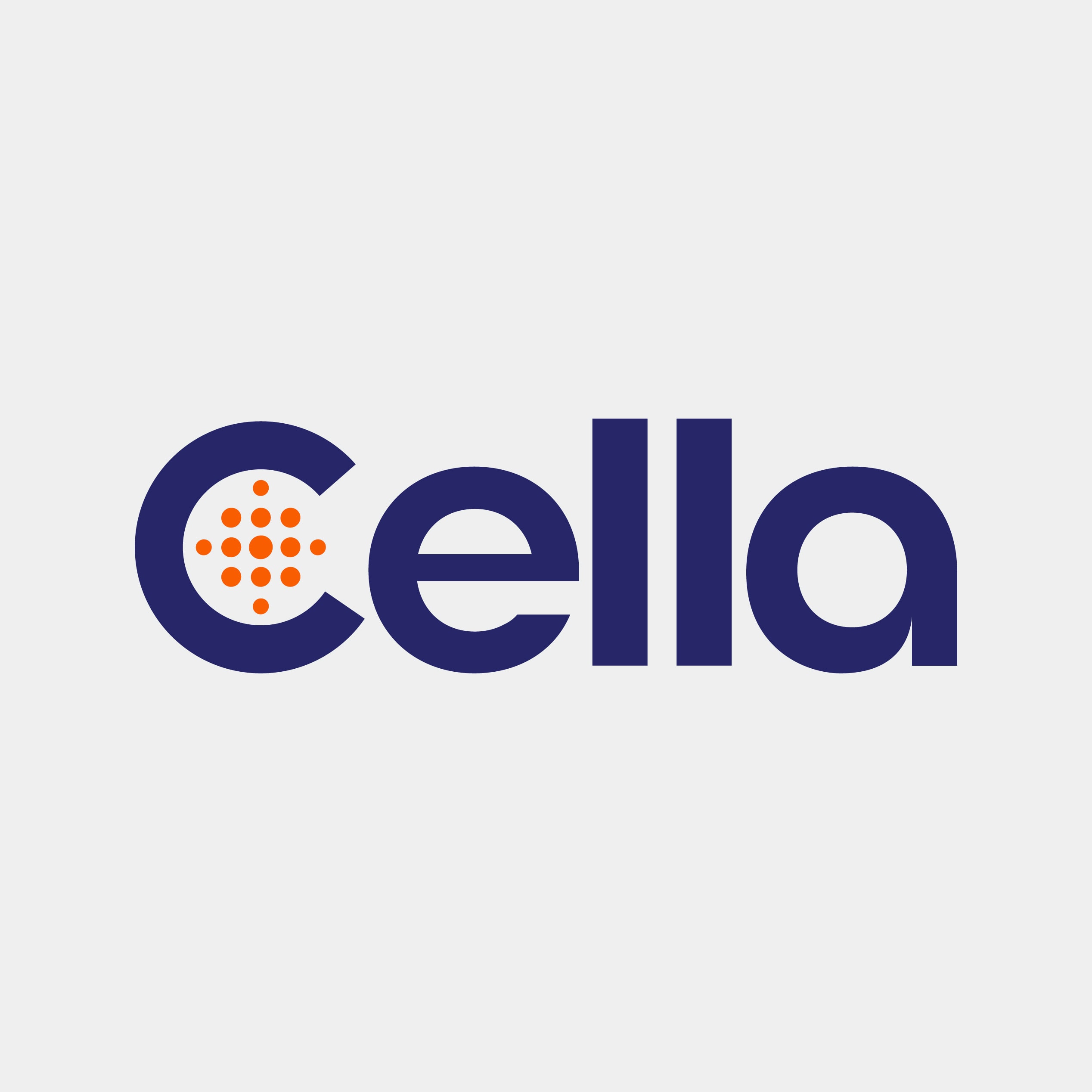
That is the product described in one word, so we drew the mark straight from it. The logo is a capital C, closed on three sides with one opening, and a run of dots inside standing for the data. A protected chamber that can still be entered.
The palette leads with a deep navy and a warm orange accent, backed by green, blue and cyan for diagrams, interface states and data visualisation. We drew a custom icon set specifically for the platform story – extract and import, one launchpad, search and find, report and beyond – rather than pulling anything off the shelf. Alongside it sits a family of editable SVG diagrams that explain decommissioning visually.
The verbal side started with the client. They gave us a short brand personality note, and that is where the voice and the taglines came from – “Cella should feel like a senior engineer making a decisive cut – calm, precise,” and “Liberate value. Retire risk.” Our job was to turn half a page into a working system: a written tone of voice guide the client can keep using after handover, and a messaging platform built on five USPs with the proof behind each one, applied across every page rather than listed on any of them.
Web design and development
Clean design, solid code, room to grow
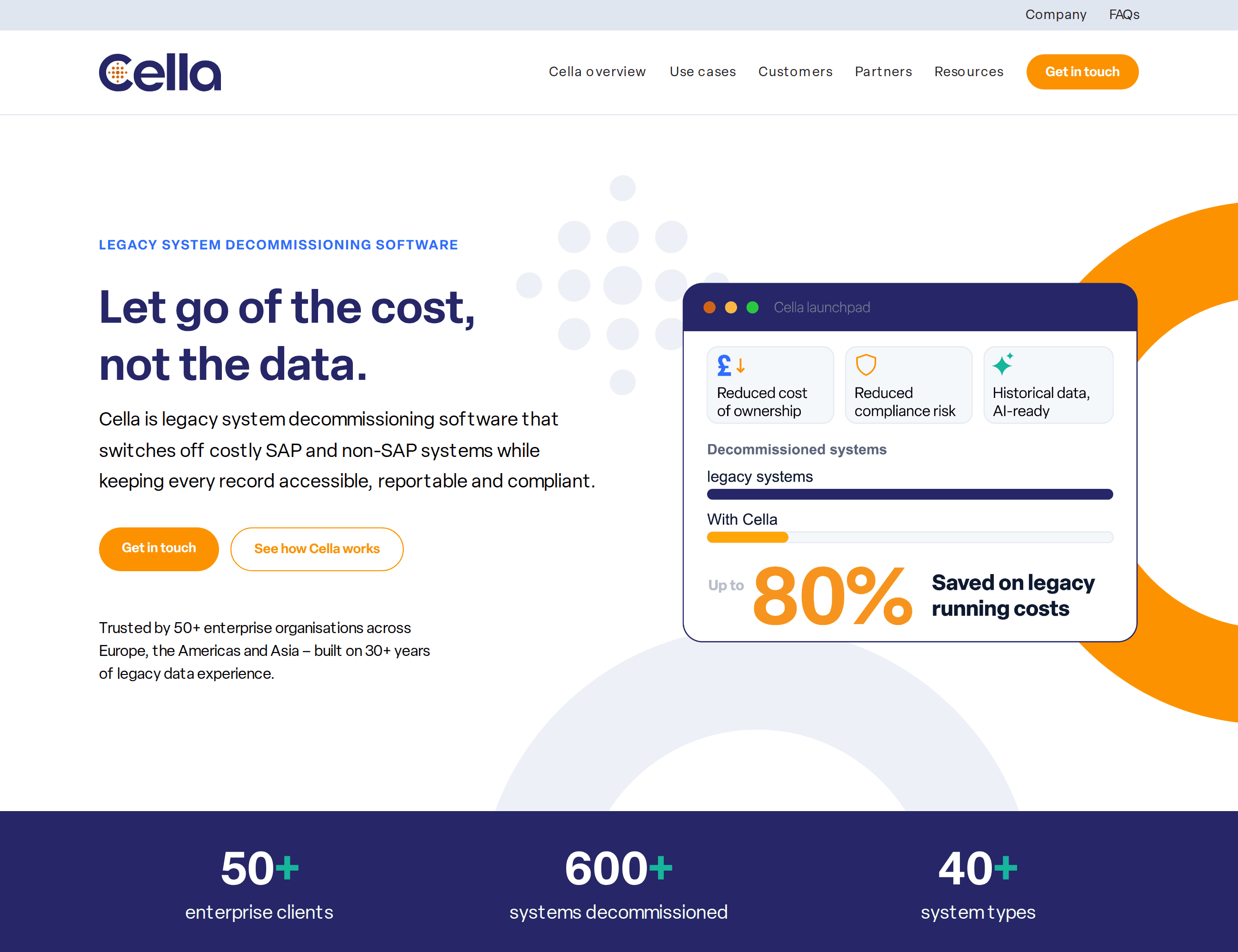
The design is clean and bold, with real space left in the layout. Motion is used sparingly, and always for a reason. The dots fill in from the centre outward – data gathering into one place, which is exactly what Cella does. The proof figures count up as they come into view, so the eye lands on the numbers. Content rises into place as you scroll. Enough to feel like software rather than a brochure.
The homepage has one job: take someone from a search result to an enquiry. It leads with the term they searched for, explains the product briefly, puts the proof high on the page and offers a single call to action. No endless scroll.
The research stage meant we knew where Cella needed to sit in the market before any design started. So we could go straight to a concept that hit the brief, rather than working the client through a spread of options – which kept the design stage short and the budget lean.
The site runs on WordPress, built from a series of bespoke templated sections – custom blocks designed for Cella rather than pulled from a library. Cella can edit all of it themselves – change copy, swap an image, add a page – and compose new layouts from the same blocks, without commissioning new web design each time and without the result drifting off-brand. It was built to be owned, not just delivered.
Written for people, structured for machines
Built for AI search
Search isn’t ten blue links any more, so we didn’t build for that.
Schema markup is the layer that tells search engines – and the AI assistants that draw on their indexes – what a page actually is: this is an organisation, this is a service, this is a product, rather than leaving them to work it out from the words alone. We wrote it across the whole site, not just the FAQ blocks, so anything reading the site knows what Cella is and what it sells. That matters more here than it might elsewhere: cella is a Latin word with a meaning of its own, and leaving an assistant to guess which one you meant was never going to end well.
The FAQs are written the way people ask, not the way they type: whole questions in plain language, because that is how anyone talks to an assistant. Each question has exactly one home across the site, so answers never compete with each other. And the FAQs page carries no keyword target at all – its job is the cross-cutting questions no product page can claim: what Cella is, how archiving differs from decommissioning, what happens to the old system.
The proof is written into the pages rather than sitting alongside them, and the figures are real text rather than baked into images – so a machine can read, quote and attribute them, not just a person looking at the page.
That’s the same thinking as the rest of the content plan. In a category where buyers don’t know the difference between two products, being the source that explains it is worth more than being the tenth vendor page.
SEO
Search came first, then everything else
The SEO work started before the sitemap was signed off: the keyword research came first, and the sitemap came before any design. What pages exist, what they are called and how they link to each other all followed from what people were actually searching for.
We ran research across around 50 keywords, clustered into decommissioning, archiving, compliance, modernisation and AI, plus organic analysis of eight competitors to find where each was weakly defended. Every page got a primary keyword, secondaries, and a meta title and description written to length – delivered as a working workbook, not a one-off report.
One finding mattered more than the rest. Archiving stores data you might need again. Decommissioning switches off an entire system and keeps its records usable for good – one is a storage decision, the other takes a running cost out of the business permanently. Cella sells the second. Far more people search for the first.
That changed the plan. The core decommissioning terms turned out to be wide open, so we went at them directly. We rank for archiving on the informational pages and sell decommissioning on the commercial ones. And the biggest volume sat in adjacent terms like information lifecycle management and data retention policy, which is where we anchored the overview and cost pages.
Product first, company second. Cella the product is the story, so the company sits in the secondary navigation. Every page worth ranking sits under the product, so a second one can be added later without rebuilding the site or breaking a single link.
We also resequenced the six use-case pages from compliance-first to transformation-first, leading on SAP and HANA transition rather than GDPR. That order matches “liberate value” instead of leading on fear.
A site this size, all about one narrow subject, has a particular problem: its own pages start competing with each other for the same searches, and none of them win. It is easy to miss, and it can hold a site back quietly for years. So every term has one owning page, and a linking map sets out which pages point to which. Nothing on the site competes with itself.
Content
Interviewed, written, verified
The copy across the site is ours, worked up from client interviews, product decks and a recorded session with Cella’s technical leads – then fact-checked by the client before approval.
That’s 30 pages of copy, FAQs, two customer case studies, a pillar explainer and five long-form white papers, each designed as well as written, with a purpose-built cover style, stats pull-outs and pull-quotes. The papers are ungated and indexable, each targeting its own research-stage term kept deliberately apart from the buying-stage product pages.
That’s the advantage of one team doing all of it. The brand voice and the copy are the same piece of work. The keyword plan and the sitemap are the same document, near enough. And the diagrams explaining decommissioning were drawn by the people who’d just spent a fortnight learning how decommissioning works.
Andy Hamlyn | CEO Cella Software
I worked with Jane & James at Union10 on our brand redesign and new website. They were a pleasure to work with; knowledgeable, creative and nothing was ever too much trouble. We are very happy with the end results and will continue to develop the relationship further with Union10. I would not hesitate to recommend.
View all reviewsThe results
Talk to us about your next project. Get in touch.
Written by Jane Comar + Reviewed by James Hofton
Last updated: October 21, 2026