Starting with a blank canvas is always a dream for us when working with startups. A distinct, cohesive brand identity defines the look and feel of a business — and has a huge influence on how people perceive it from day one.
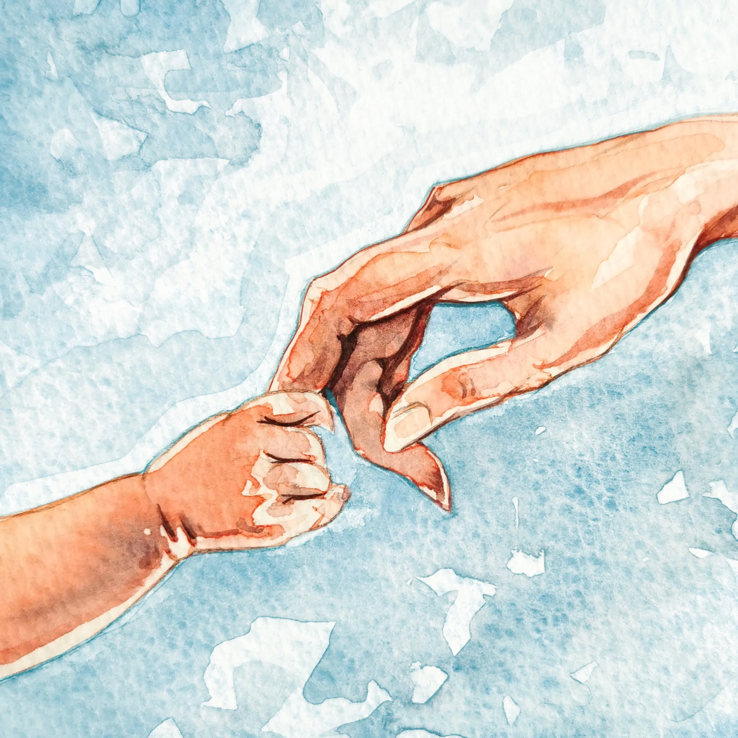
We explored a number of working titles, including Recipe Therapy and Gastro Therapy, before landing on Cupboard Love. The name nods to one of the earliest theories around why we form relationships, highlighting the powerful role food can play in connection and care. It perfectly reflected Andrea’s vision — linking attachment-based therapy with the nourishing, grounding qualities of food.
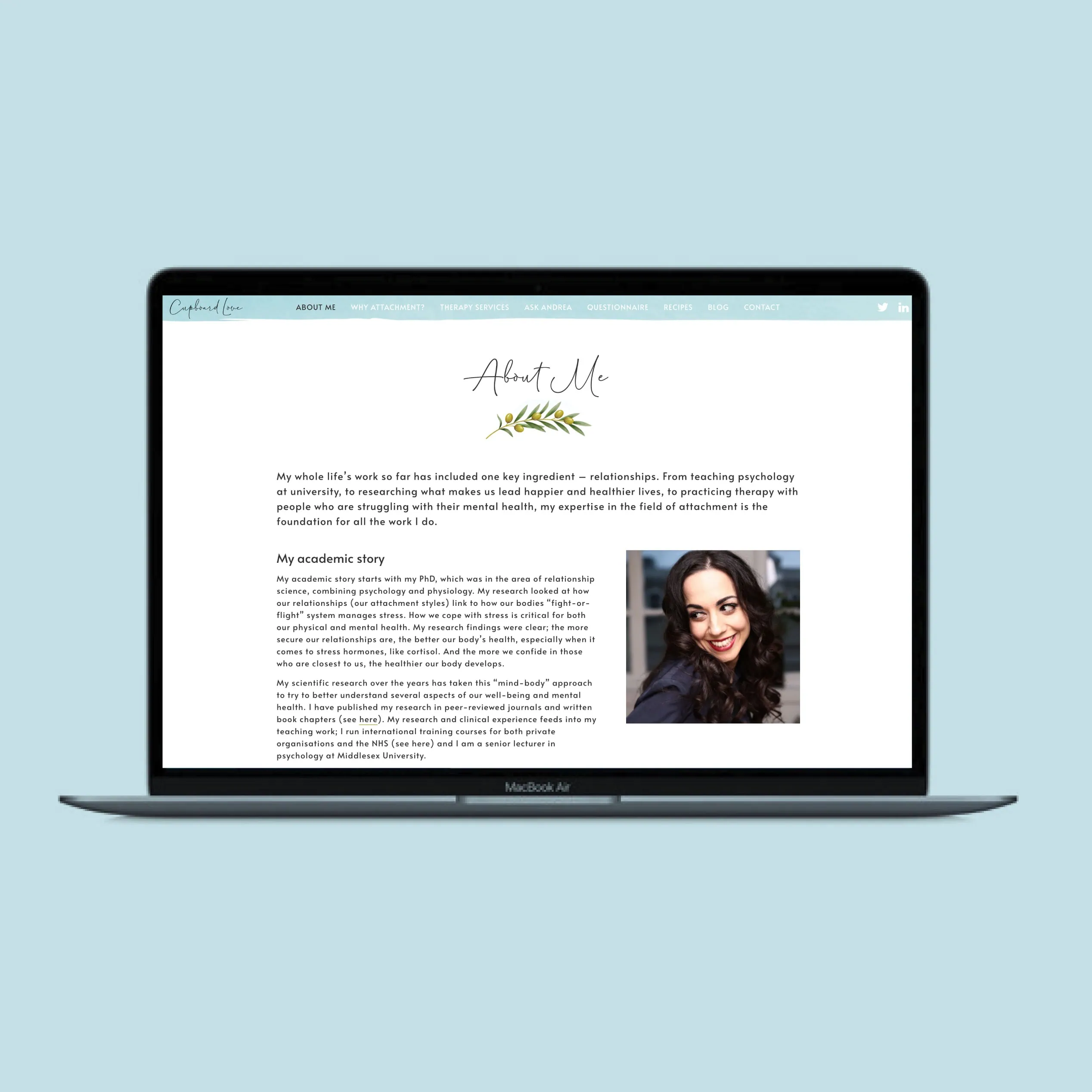
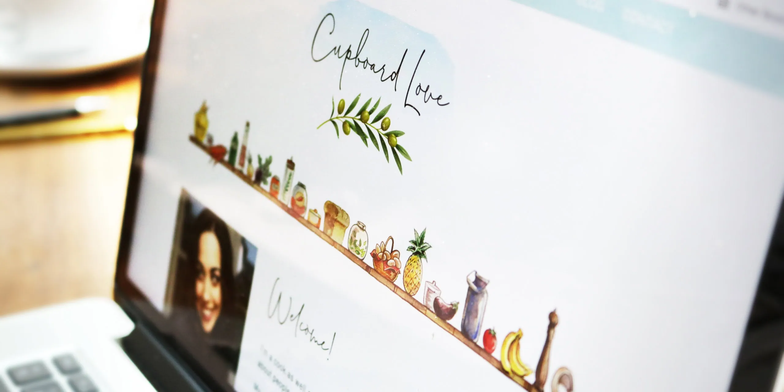
From there, we developed brand concepts that captured this connection between relationships and nourishment. The design direction centred on handwritten-style typography, soft watercolour imagery and a gentle colour palette. It needed to feel non-corporate and personal — reflecting Andrea’s warm, caring nature — and create the sense of a welcoming, trusted space, much like the one-to-one relationship she builds with her clients.
The final logo concept features an olive branch — a symbol of peace, harmony and hope — which communicates Andrea’s philosophy beautifully. From that starting point, we built out a wider visual identity using the same palette, typography and illustration style, ready to roll out consistently across the website. The goal was a bespoke identity that feels appealing, recognisable and perfectly aligned with Cupboard Love’s audience.