Rebranding a business for Erik Gorter Classics

Rebranding a restoration classic

Client: Erik Gorter Classics

Completed: 15th April 2020

White lion head inside a “G” icon on an orange background
White lion-in-“G” emblem over a black-and-white close-up of a classic car detail
Erik Gorter Classics wordmark with an orange lion emblem on a pale grey background
Black serif letter “G” on a pale grey background
Outline sketch of a lion head inside a “G” emblem on a pale grey background
Erik Gorter Classics wordmark in white on a dark background

Insight

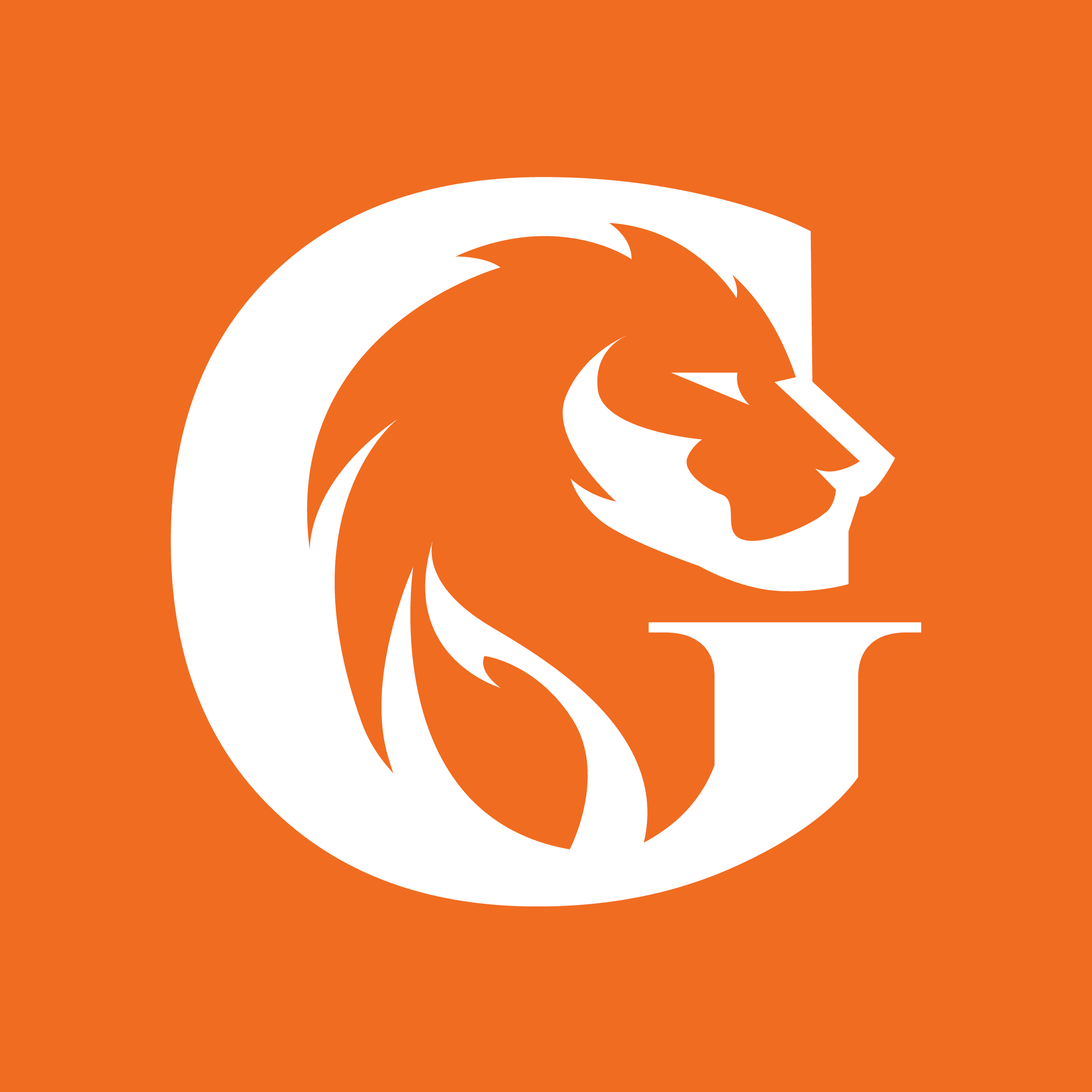
Erik Gorter is a classic car restoration specialist with a deep connection to his Dutch heritage. His business restores vintage Mercedes-Benz — a prestigious marque — so the new identity needed to feel premium, confident and perfectly aligned with the quality of the work.

The existing website was dated and lacked a clear brand presence, which made it harder to communicate that craftsmanship at first glance. Union 10 were brought in to create a new logo as the first step in a wider rebrand and marketing strategy.

When rebranding a business, we start with research — understanding the company’s history, audience and market — so the final design feels distinctive, authentic and relevant to the sector. The brief was clear: the new logo needed to reflect Erik’s roots using the Dutch lion and traditional orange, while still feeling high-end — heraldic, yet modern.

Logo design

Our challenge was to use a lion motif in a way that felt unique to Erik Gorter Classics, rather than a generic symbol. We began by exploring ways to anchor the mark to the brand itself — and the letter “G” gave us an obvious, ownable route.

Through sketches and iterations, we refined the relationship between the G letterform and a stylised lion’s head. The aim was a mark that communicates strength and prestige, while staying simple, modern and confident — a key balance when rebranding a business in a premium sector.

The final illustration style is intentionally clean and unfussy: sharp lines, minimal detail, and strong clarity. We made sure it performs beautifully at any size, in full colour or black and white — ready for everything from web headers to print applications.

Brand guidelines

Once the rebrand was signed off, we produced a clear set of brand guidelines covering colour, typography and practical usage rules. This gives the client a straightforward system to apply the identity consistently across future marketing — an essential step when rebranding a business and rolling it out across multiple touchpoints.

We also supplied a complete set of master files — including JPG, PNG and vector formats — ready for print and digital use.

If you’re considering rebranding a business, get in touch to find out how are brand design services can help you.

Written by Jane Comar + Reviewed by James Hofton

Last updated: January 14, 2026

Get in touch


Talk to us about your next project. We’d love to hear from you.