Brand refresh for Modern Networks

Modernising Modern Networks with a contemporary, consistent brand identity

Client: Modern Networks

Completed: September 2019

Abstract Modern Networks brand shapes in dark tones with a bold red form
Modern Networks brochure and letterhead stationery mockups on a light background
Modern Networks wordmark with red icon over a laptop keyboard background
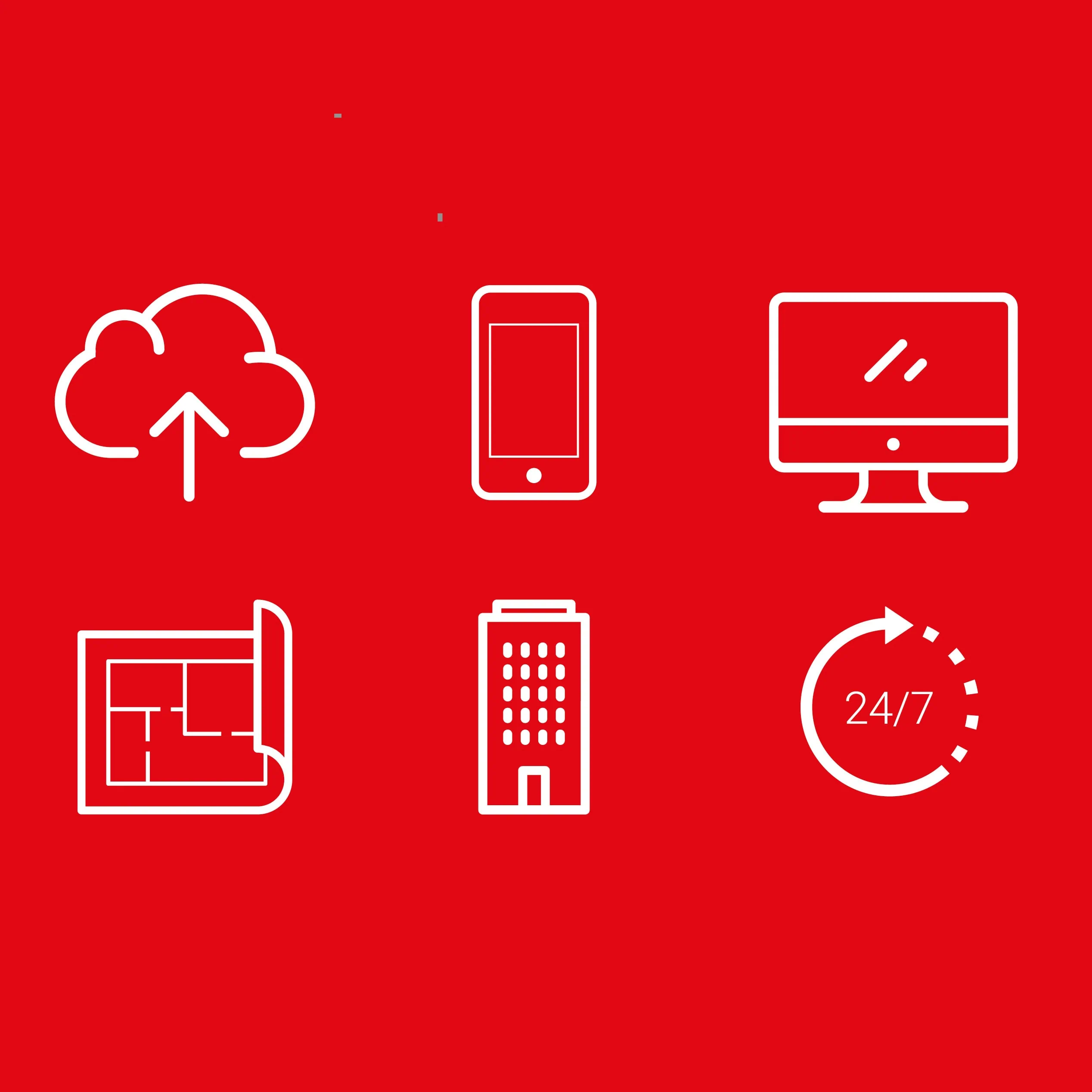
White line service icons on a red background, including cloud, phone, desktop and 24/7
Modern Networks brochure cover featuring a hand using a smartphone with a technology headline
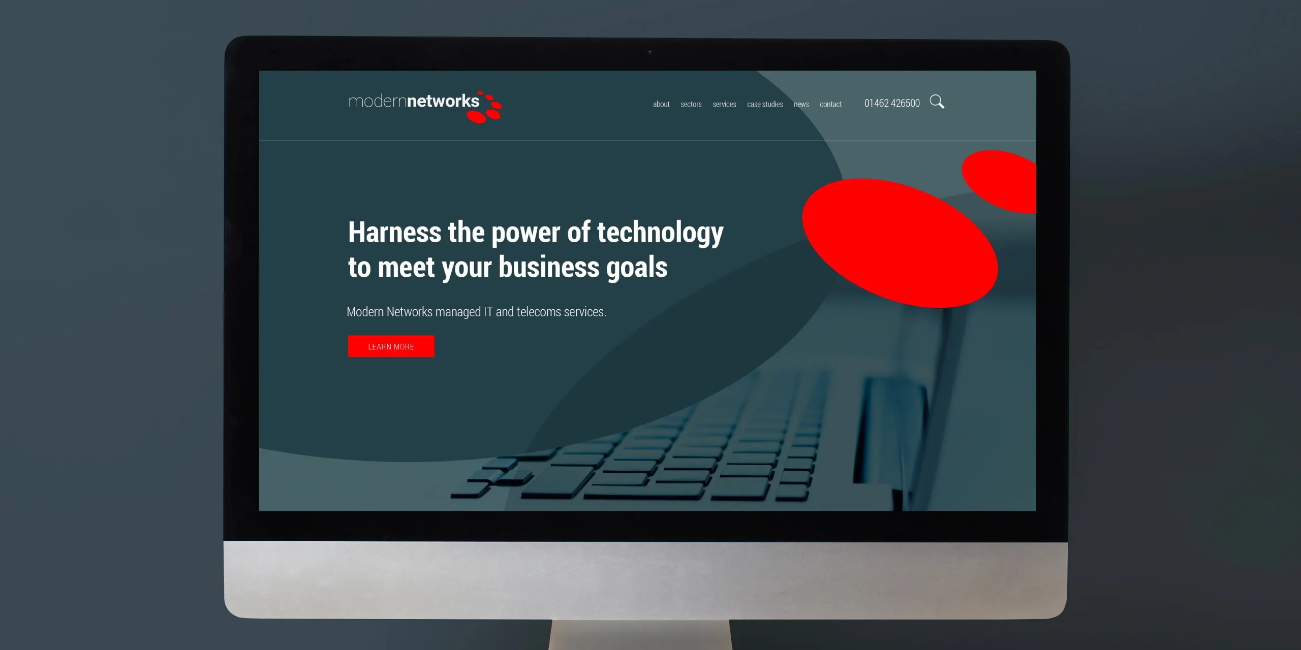
Modern Networks website homepage shown on a desktop monitor with headline and red accent shape

Insight

Modern Networks is a leading IT and telecoms provider to the UK’s commercial property sector. With nearly 20 years in the business, they’d built up a large library of marketing materials — but the brand had become fragmented over time. Straplines varied, logo versions were inconsistent, and documents didn’t feel like they belonged to one company.

The brief wasn’t to reinvent the brand from scratch. It was to deliver a considered brand refresh — refining what already existed, introducing structure, and building consistency across print and digital without disrupting day-to-day use.


Brand refresh

This brand refresh looked at the full identity system: logo balance, typography, colour, imagery, iconography and document layout.

The original logo felt visually uneven, with an oversized circular motif competing with the company name. We rebalanced the relationship between mark and word, tightened the type, and updated the colour values — softening the black into a dark grey and lifting the red to feel cleaner and more contemporary.

All adjustments were documented in a new set of brand guidelines, giving the team a clear reference point for applying the brand refresh consistently.

A key request was the colour palette. The brand previously relied on black and red alone, which could feel harsh — especially on large presentation backgrounds. To solve that, we introduced a secondary palette of softer greys, giving the brand more flexibility and making layouts calmer, clearer and easier to read.

Brand development

With the foundations of the brand refresh in place, we expanded the visual language. We took the oval form from the core logo and used it to create organic, curved background graphics — a distinctive design device that now sits at the centre of the identity.

Built using tints of grey and red, these shapes add depth, reduce the intensity of solid blocks of colour, and create a recognisable look across collateral. The same rounded forms also informed a refreshed icon style, so supporting graphics felt cohesive rather than generic.

Rolling out the brand refresh

Many of Modern Networks’ key assets live in everyday tools — Word and PowerPoint in particular — and these are used widely across the business. So the rollout had to balance design quality with real-world usability.

We built editable templates that are easy to work with while protecting consistency. That meant practical decisions such as using accessible Google Fonts and locking key design elements into background layers, so teams can update content confidently without unintentionally dismantling layouts — keeping the brand refresh intact across every document.

Final files

Following the brand refresh, we delivered a full suite of templates and editable assets, including business cards and stationery, brochure layouts, exterior signage, PowerPoint presentations, Word document templates, email newsletter assets, email footer design, social media branding — and a new website.

Website design and development

The website was built in WordPress, but designed and developed as a fully bespoke build. The brand refresh translated cleanly into digital, with the same organic curve devices, matching web fonts, and a colour palette aligned to the printed materials — creating a consistent experience across every touchpoint.

Matthew Reeve // CEO Modern Networks


I’m so pleased with the results. We’ve had a complete website refresh, new branding on our buildings, brand guidelines and standardised documents created. We’ve gone from a collection of disjointed and mismatched branding to a consistent, clear and contemporary look for all our digital and printed media. Very very happy!

View all reviews

Written by Jane Comar + Reviewed by James Hofton

Last updated: January 14, 2026

Get in touch


Talk to us about your next project. We’d love to hear from you.