Brand identity and development for Newall Consulting

Combining strategy with creativity: building a strong, effective and consistent brand identity

Client: Newall Consulting

Completed: October 2020

Newall Consulting branded water bottle in monochrome
Newall Consulting logo shown on a mobile phone beside an iMac
Newall Consulting branded phone case design in black and white
Newall Consulting logo over a London skyline backdrop
Newall Consulting business cards and stationery in monochrome

Overview

Scott Newall is a London-based brand consultant who helps founders, MDs and CEOs with strategy and brand development.

He approached us to create a distinct logo and a wider brand identity for Newall Consulting. A key objective was consistency — building recognition across every touchpoint and making a stronger impact with his target audience.

Brand identity and development

We like to start every project by building a clear understanding of the business behind it — your mission, values, personality, positioning, and the market you’re competing in. A brand identity should do more than look good. It should define who you are, set expectations, and help customers quickly understand what makes you different. To do that well, it needs to be distinctive, confident and memorable — which is why we get the foundations right before we move into design.

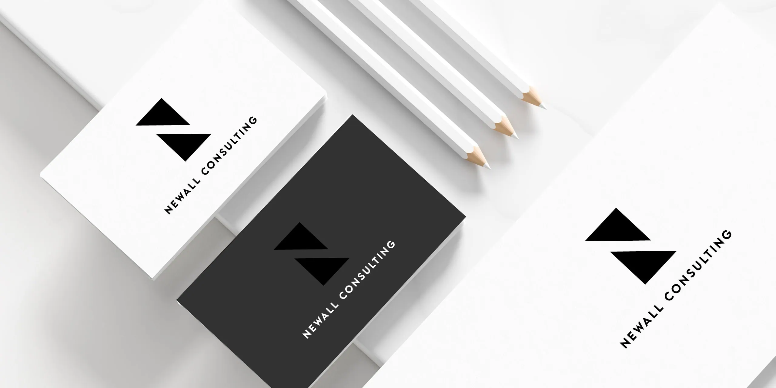
With the research phase complete, we worked closely with Scott to develop a bold visual identity to support the next stage of his business.

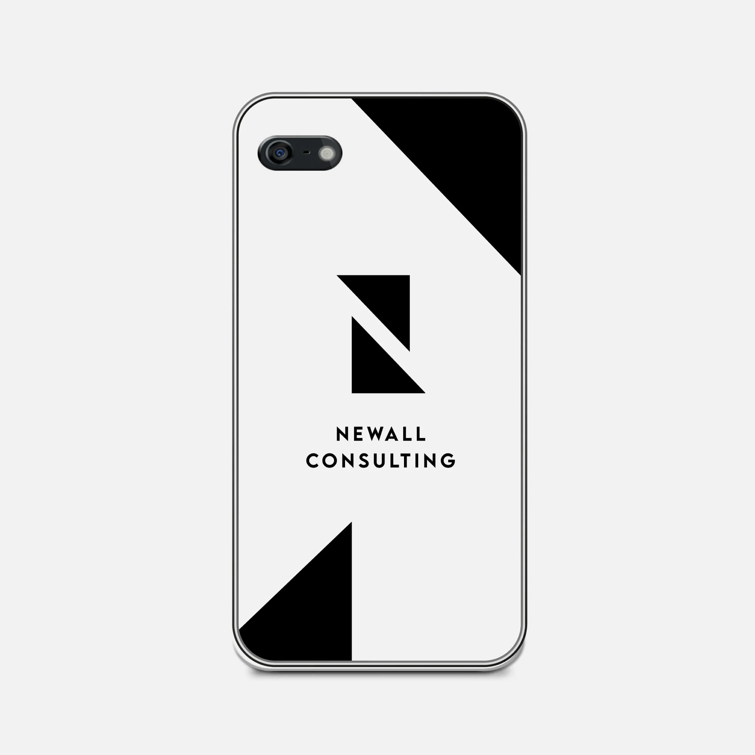
The direction needed to balance the professional and personal nature of Scott’s consultancy — creating a strong first impression and a brand people would feel good about engaging with. It also had to be practical: simple to roll out consistently across LinkedIn and Instagram, and flexible enough for promotional merchandise like baseball caps, drink bottles and phone cases.

Scott was already using a monochrome look on LinkedIn, so we took that as our starting point and built a more defined, ownable identity around it.

Logo design

Because the logo is the cornerstone of any brand identity, we started there — developing three initial concepts before refining the final direction. Keeping to a black-and-white palette, we paired clean sans serif typography with straight-edged geometry to create a sleek, modern feel.

The final mark is built from the negative space of the “N” in Newall. Minimal and contemporary, it forms a distinctive, instantly recognisable core that works across every touchpoint. The high contrast between black and white creates crisp lines and a strong interplay of light and dark.

Black brings authority, strength and professionalism. White adds clarity, openness and positive energy. Together, they strike a confident balance — bold without being loud.

As with every identity we create, we designed the logo with real-world use in mind. Scott received a suite of logo variations and file formats, so he always has the right version for different digital channels and future applications.

Extending the brand

One of the key aims of our brand identity work is to build a strong brand personality — and make sure it’s flexible enough to support future growth.

With the core building blocks in place, we developed the brand into practical design assets that create a clear, consistent and lasting impression across Scott’s current channels — and any new products or services in the future.

Alongside a full suite of logo files and banners, we produced branded PowerPoint slide templates and social templates for LinkedIn and Instagram. We also supplied mockups for upcoming merchandise featuring the logo, including baseball caps, drink bottles and mobile phone cases.

Together, these assets help Scott apply the brand consistently across his digital presence today, and roll it out confidently as the business evolves.

Business brand guidelines

To complete the project, we produced clear brand guidelines  — helping Scott apply his identity consistently and build recognition over time. The guide covers the colour palette, typography, logo usage, brand tone and practical do’s and don’ts.

A cohesive identity doesn’t just look better — it increases perceived value. And without clear guidelines, consistency is hard to maintain. With them in place, the brand feels more professional, more reliable, and easier to manage as the business grows.

We’ve delivered brand identity and rebranded projects for a wide range of clients, from start-ups to established names. Take a look at our work and get in touch if you’d like to discuss how our branding services could support your business.

Written by Jane Comar + Reviewed by James Hofton

Last updated: January 14, 2026

Get in touch


Talk to us about your next project. We’d love to hear from you.