Beer label design for Savour

Carefully crafted: a fresh look for a new microbrewery

Client: Savour

Completed: March 2015

Savour “S” monogram with wheat detail and radiating lines on textured paper background
Three Savour beer bottles on a wooden table with a glass of beer in the background
Savour beer label artwork layout showing typography, ingredients panel and barcode
Savour beer bottle lineup showing different label colours and styles in shallow focus
Savour label typography panel reading “Savour British Blonde 33cl” on textured background
Savour Saison bottle with green “S” label beside a glass of beer on a wooden table

Insight

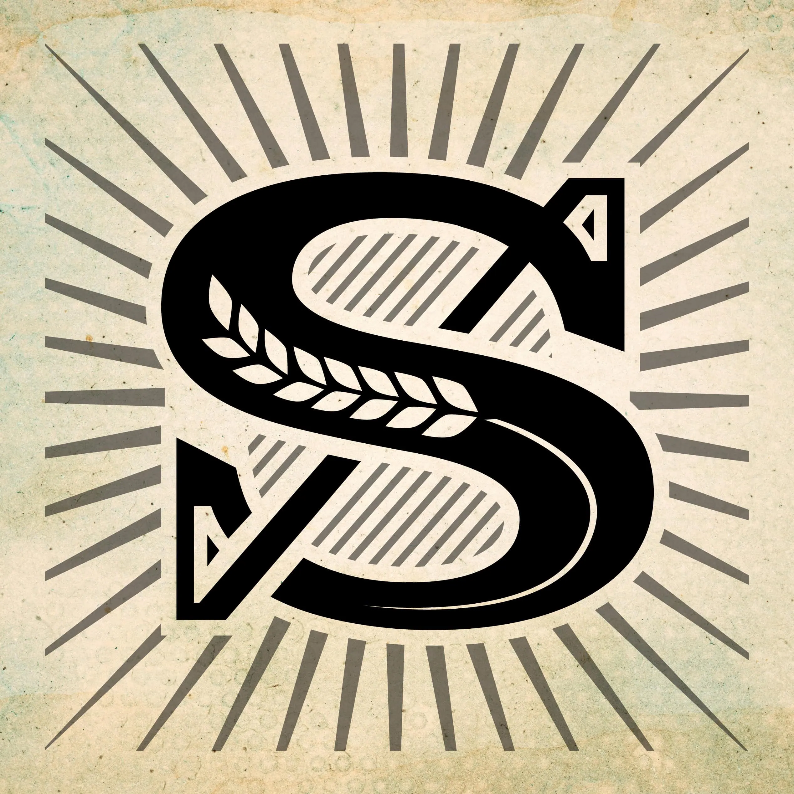
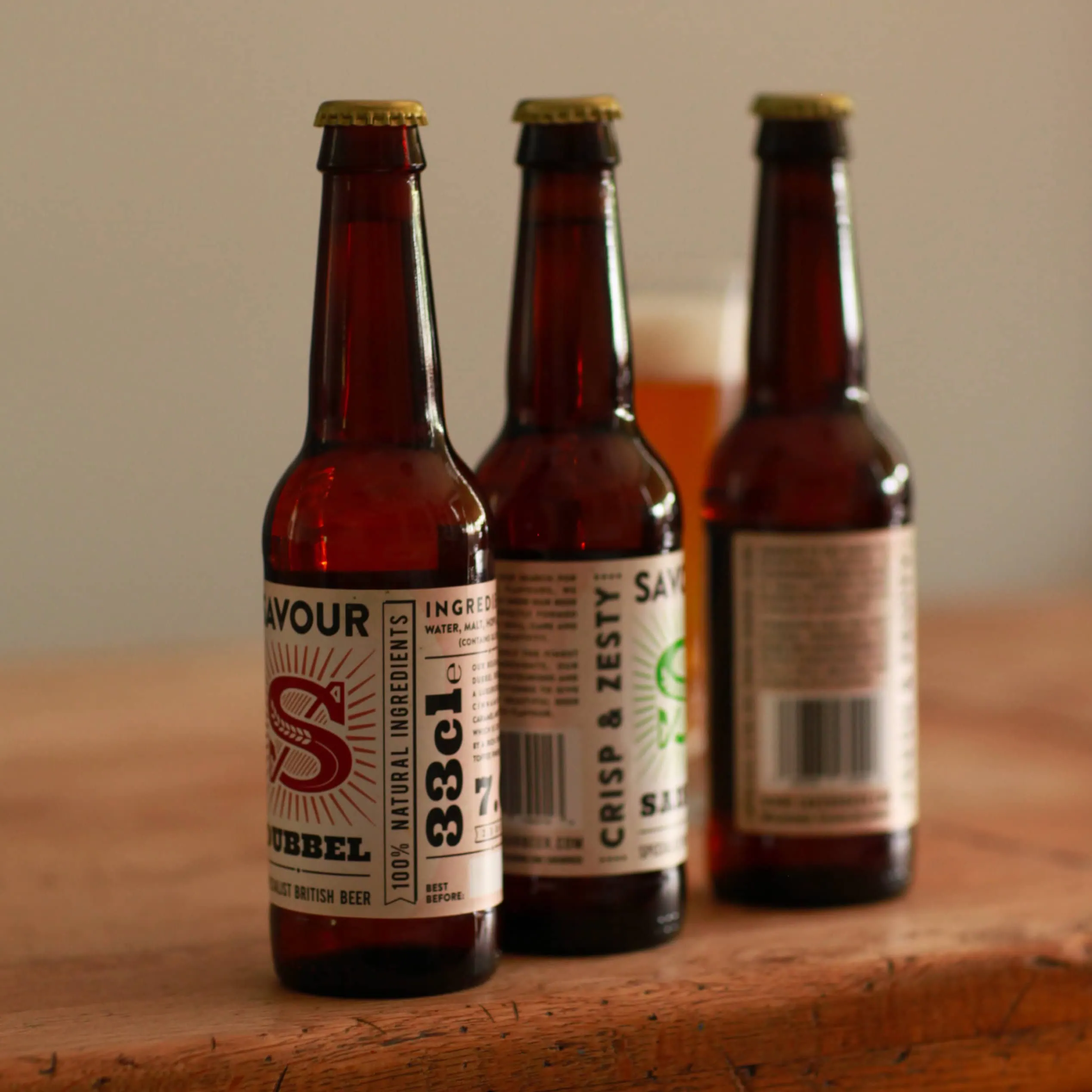
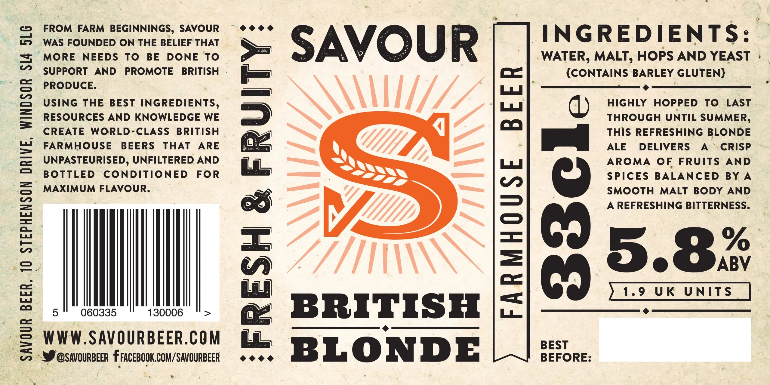
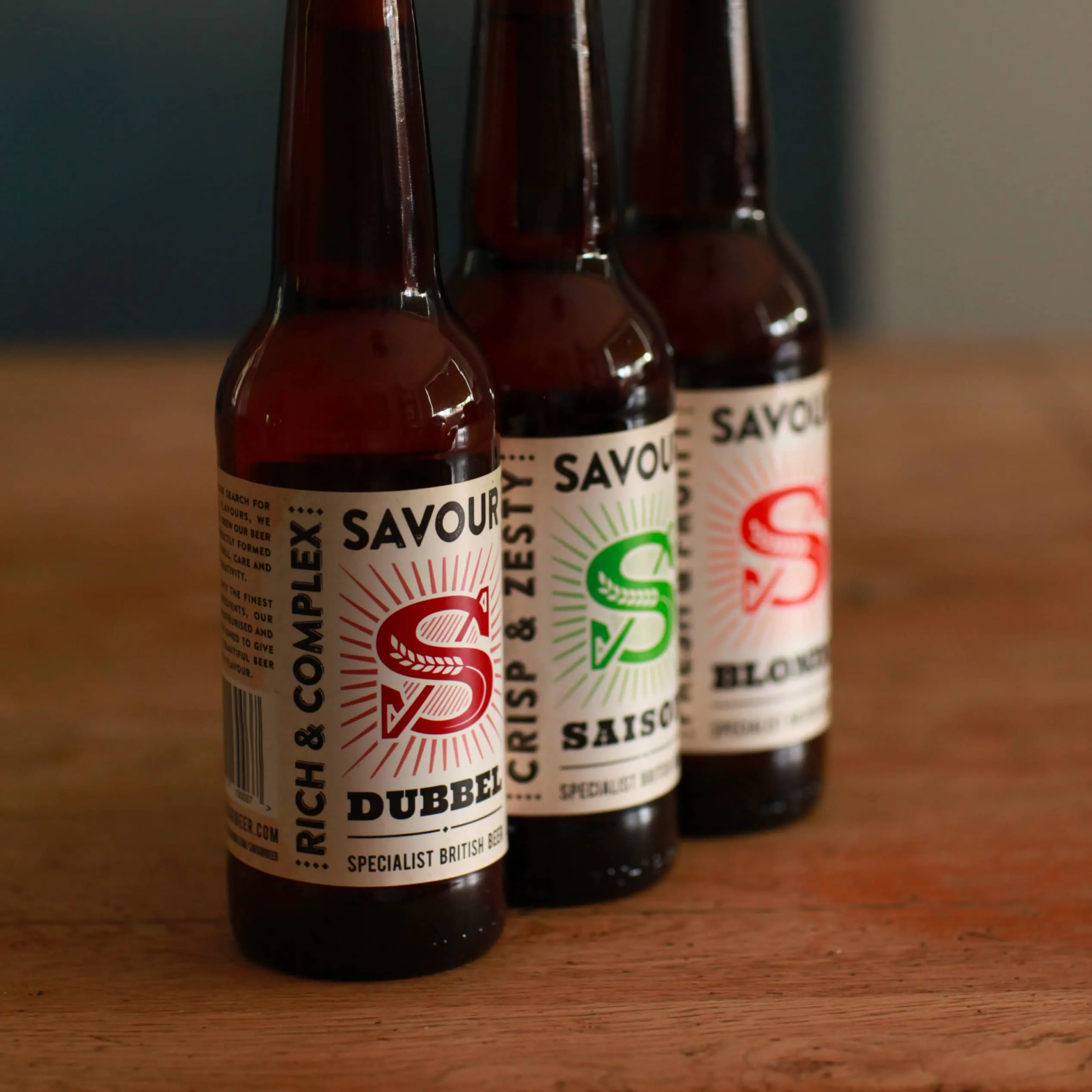
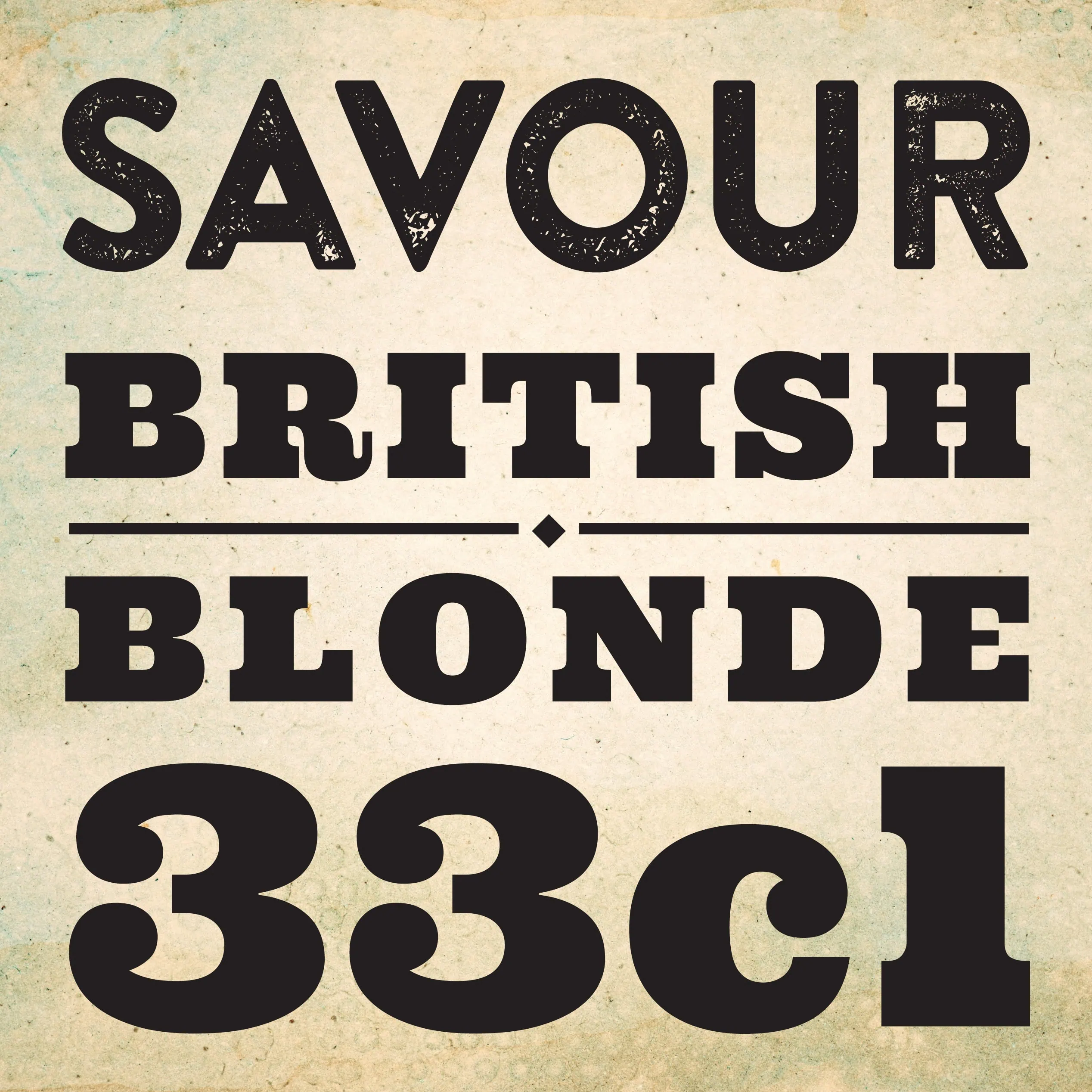
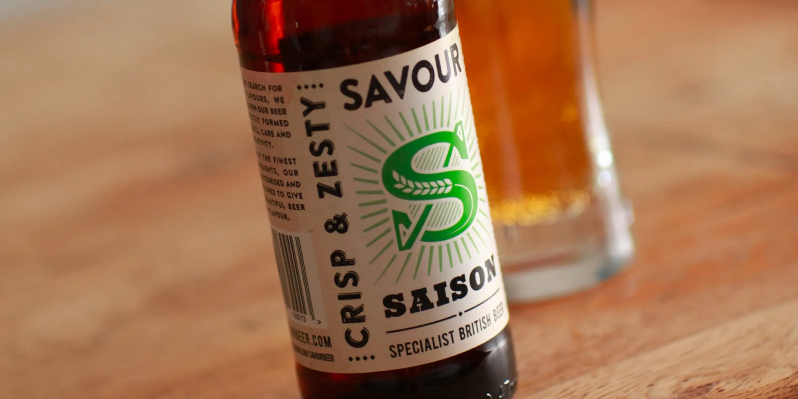
Working with start-up brewery Savour, we delivered a new suite of packaging and beer label design to help them connect with their target market more effectively. By evolving their existing look, we created a clearer, more confident identity — one that better reflects the quality, craft and personality behind every bottle.

Creating shelf appeal

The brief was simple: stand out, and stand for something. Savour wanted to appeal to the growing UK craft beer audience, while making it clear they’re more than “just a craft beer”.

Their mission is rooted in the flavour profile of Belgian saison beers — with the refinement you’d associate with a great wine or spirit. That discerning approach runs through the range, from sparkling brut beers in champagne-style bottles to larger-format Methuselah bottles designed for sharing (or celebrating).

Our job was to translate that ambition into a packaging system that feels premium, modern, and instantly recognisable on shelf.

Label design

We created beer label design across Savour’s core range — Saison, Blonde and Dubbel — moving away from the usual “beer for blokes” cues. Instead, we developed a more inclusive label design language, built to appeal to a wider audience without losing attitude.

The creative direction had a lightly irreverent edge, with a subtle nod to the craft scene. Bold typography and confident layouts draw the eye, while giving centre stage to the striking “S” within Savour’s logo — turning it into a recognisable anchor across the range.

For Savour’s more exclusive products, we evolved the same beer label design approach with a quieter, more elevated finish. We toned down the palette, refined the type, and introduced premium details such as foils and neck labels — bringing a sense of ceremony and luxury to the bottle.

We love helping new ventures — take a look at our work with Cupboard Love for another example of how we support start-ups.

Written by Jane Comar + Reviewed by James Hofton

Last updated: January 14, 2026

Get in touch


Talk to us about your next project. We’d love to hear from you.