# Technology website design

Coreix

A stand-out digital brand, backed by great UX.

01

Insight

Coreix provides high-end, complex web hosting services for big business. Our brief was to develop a web hosting website design that delivers a distinct digital brand.

With a series of marketing campaigns planned, the website had to clearly convey Coreix’s capabilities and its wide product range.

Ultimately, the design had to deliver on converting website visitors into potential sales leads.

02

Branding

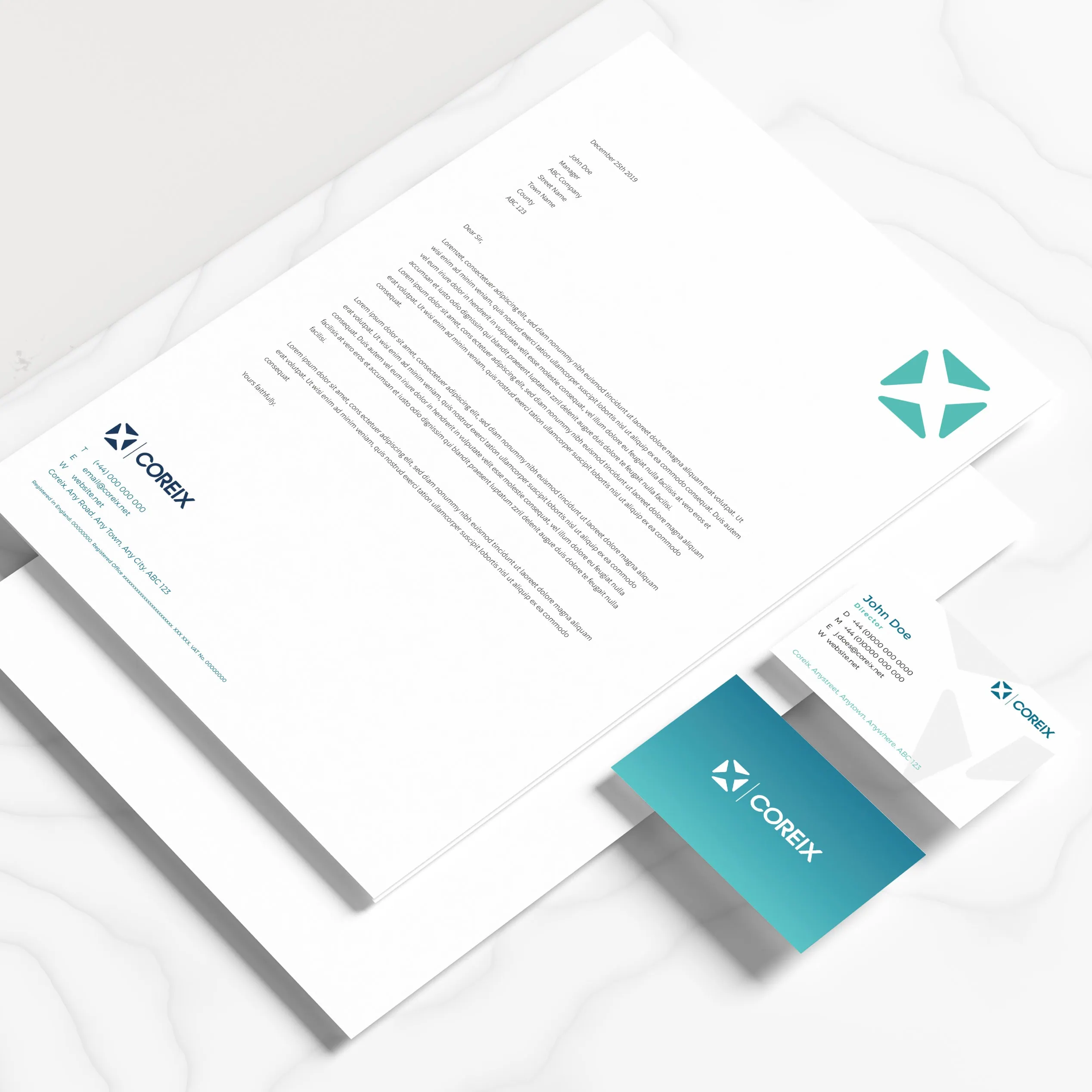
Coreix works at the heart of the tech world, but its clients come from a broad range of industries. We evolved their brand identity from a tech-focused position to one with wider appeal and impact.

Our approach combines bold, clean fonts with a new brand palette – featuring a striking teal. Contrasting sub-shades of purple and blue aid product theming and navigation.

03

Web design

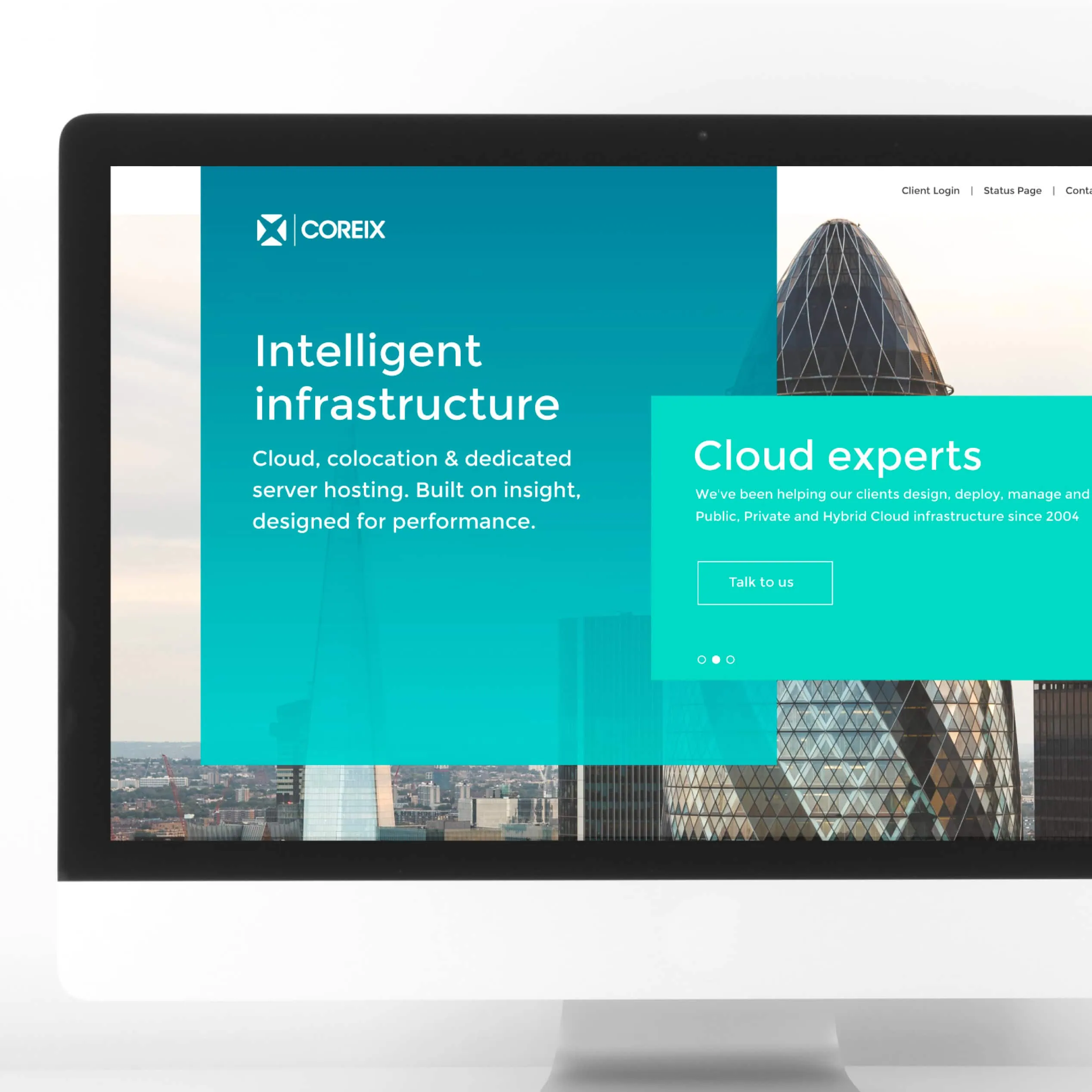
Our overall look and feel balances short bursts of colour against a background of muted photography, in tones of grey and black.

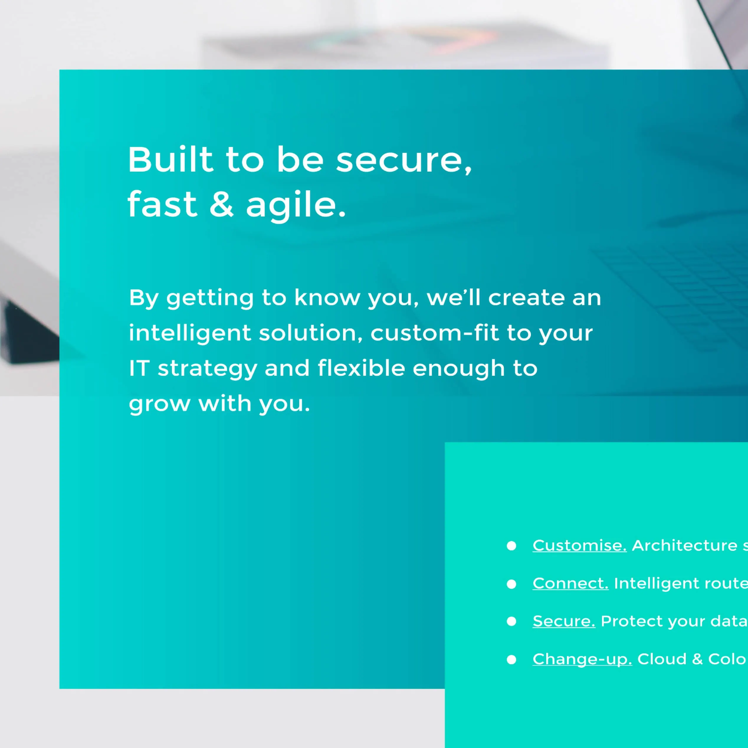
Use of transparency softens the design and creates a sense of movement by revealing stunning background imagery, as the user scrolls.

The home page showcases a London city scape, as for many clients this is a key USP. Additional stock photography was carefully selected to show people engaging with tech. This imagery spans the site, to evoke a more approachable, ‘human’ first impression.

04

UX

We honed-in on user experience (UX), to ensure navigating Coreix’s complex range of products and services is easy.

Product and service options are consistently themed into three distinct colours, with simple icons created to represent each one.

Prominent (but not pushy) call to actions are integral to the design. There’s always a reason to get in touch!

Overlapping boxes help the user to scan content in a logical way, providing bite-sized chunks of information to avoid over-whelming less tech-savvy readers.

Product pages and service pages employ simple icons to communicate key USPs such as speed, resilience, compliance and security – all vital inclusions for an effective technology website design.

05

Content

With a mixed audience – including tech experts, plus decision makers with little tech background – the content communicates technical weight, without jargon overload.

Our copywriter developed clear messages to communicate what sets Coreix apart in the market. These are given high priority in the design.

We transformed detailed technical information into succinct product overviews, aligned to key business goals – specifically to appeal to non-technical decision makers.

We also created the concept of Coreix’s ‘above + beyond’ commitment to customer service, to really promote this strength of their company.

Finally, the content needed to persuade users to contact Coreix. We developed bold calls to action with the aim of increasing their sales pipeline.

06

Web development

We followed specific technical requirements for this build. As Coreix already have in-house coding skills, we built this website using PHP, html and CSS (instead of WordPress).

Every page was built from scratch to deliver the unique aspects of our design. In line with engaging potential customers, we added a flexible live chat feature, plus time-sensitive functionality on the contact us page to signpost users on the best way to engage at different times.

Once built by us, we handed the reigns to Coreix on this one. With their advanced in-house skills, they’re able to update, maintain and host their website independently – in a really cost-effective way.


Date Completed // November 2019


// Share this page

07

Related Content