Taymount Clinic needed a new website that better reflected the clinic’s expertise and helped patients feel informed, reassured and ready to take the next step. The brief was to deliver a considered medical website design — with clearer messaging, stronger credibility, and a calmer overall experience for a sensitive subject area.
Medical website design and branding for Taymount Clinic
Medical website design for a pioneering digestive health clinic
Client: Taymount Clinic
Completed: March 2020


Brief

Insight
Taymount Clinic are pioneers in digestive health. They were the first clinic in the world to offer a specialised Gut Flora Transplant (FMT) programme in 2011, but the previous site didn’t communicate that authority or seriousness.
Established in 2003, Taymount has supported thousands of patients, with over 3,000 people completing programmes since the FMT service launched. A growing network of partner clinics worldwide continues to broaden access and improve the process for patients elsewhere.
The old site relied heavily on stock photography — much of it light-hearted and off-message — which made the brand feel uncertain. For a clinical service, the website needed to be more confident and more informative. The aim of the project was to reposition Taymount as the leaders they are, and create a medical website design that built trust from the first visit.
Branding
With a delicate subject such as FMT, the identity needs to feel calm, professional and respectful — without becoming vague. Taymount already had a logo, but there was little beyond that, so we extended the system with a clear set of visual building blocks and applied them through the website as part of our brand design work.
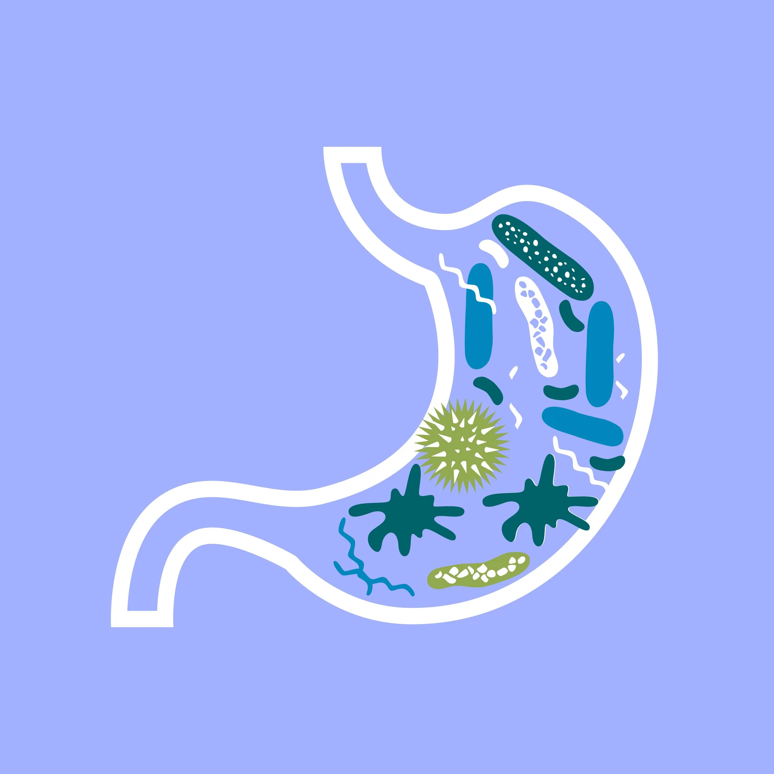
Imagery and tone were crucial. We developed a harmonious pattern that adds warmth and consistency across the brand, without trying to represent the treatment literally. The palette was expanded to include soft lilacs and additional greens alongside the existing blues, giving the design a gentler, more balanced feel. A suite of distinctive icons was created to make content clearer and more scannable.
Photography became one of the most important elements of the project. Moving away from generic stock, we commissioned a shoot with Mike Goldwater to capture an honest view of the patient journey — the clinic, the team, and what patients can expect — helping the brand feel transparent and grounded. This approach supports the wider goal: a medical website design that feels credible, human and reassuring.
Website
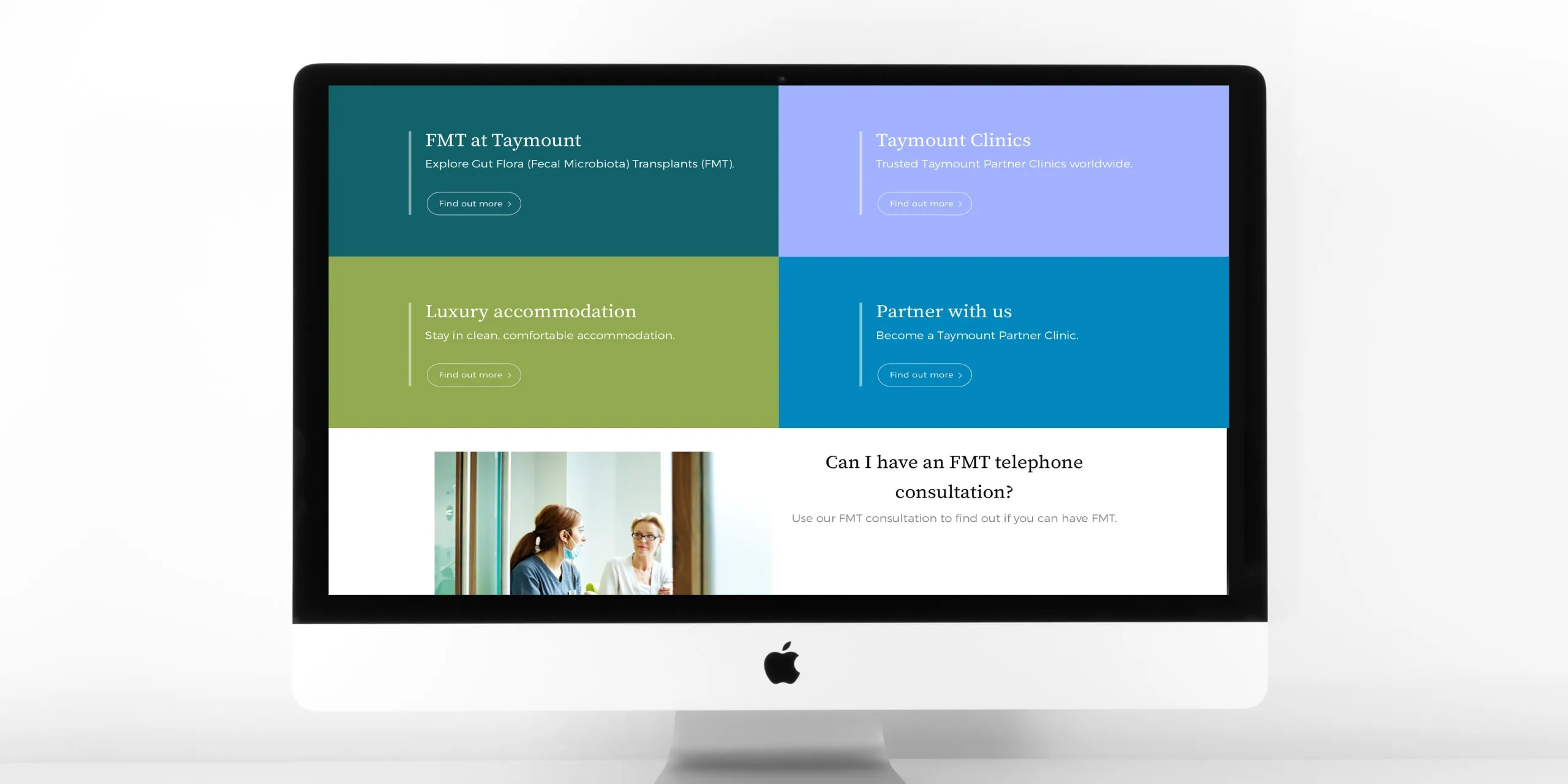
The finished website brings together the brand identity, photography and content into a calmer, more confident web design experience. It’s easy to navigate, easy to contact the clinic, and clearer about the treatment process — answering the questions patients genuinely need addressed.
By combining thoughtful UX with sensitive content structure, the new medical website design positions Taymount Clinic as a trusted authority in their field, while making prospective patients feel supported, informed and confident in reaching out.
Written by Jane Comar + Reviewed by James Hofton
Last updated: January 14, 2026