# A responsive architecture website design
LOM Architecture & Design
Modular, responsive design: prioritising content to connect with people
Insight
LOM – a London-based architecture and interior design practice – wanted to place greater emphasis on their work and people, as well as making key content more accessible to their users.
Our responsive, modular architecture website offers LOM the flexibility to prioritise how content is presented and showcases their dynamic, inspiring range of work.
Web design
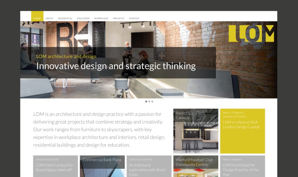
A key priority was to design a homepage that would give users an immediate insight into LOM – capturing key information about their ethos and breadth of projects, plus their news and upcoming events.
Our modular design, which follows the brand palette of yellow and grey, gives LOM the freedom to prioritise how content appears on the home page.
Bold hero images provide a perfect space for showcasing LOM’s inspiring work. The rest of the page offers a hierarchy of information, based on user needs.
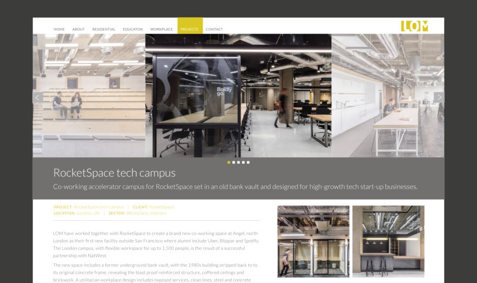
Overall, we created a clean, simple look and feel. Typography and graphics are deliberately muted, to allow the stunning range of project images to take centre stage.
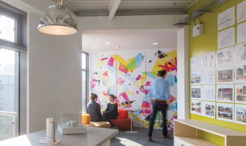
Beautiful staff and office images by Mike Goldwater are used throughout to give users a sense of the people behind the success of LOM.
What our client said
Union 10 Design is a great company to work with. Friendly, knowledgeable and reliable. I would not hesitate to recommend them to other businesses looking for website design services.
Rosie Groves // Website Manager (LOM)
03
Web development
As always, we customised the WordPress content management system to suit long term content needs. For example, the Google map, on the homepage can be edited in seconds by LOM to add new project locations.
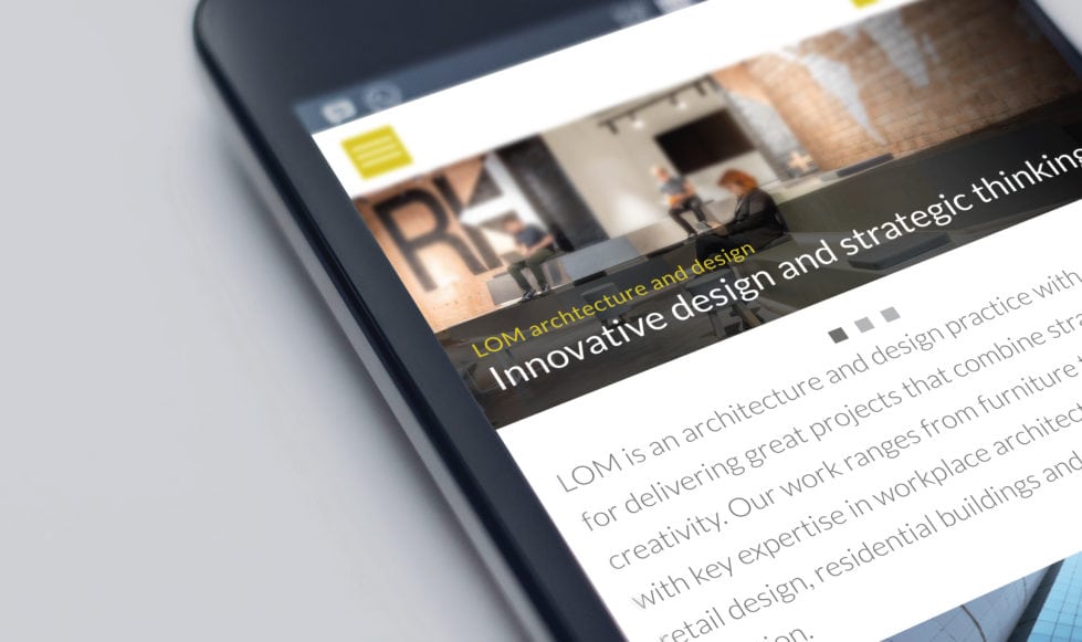
The modular design of this site supported the development of a responsive design. This ensures the site functions well across all user devices.
We also paid close attention to technical functionality, optimising the site for performance and speed by serving up different image sizes depending on screen size and the use of sprite sheets to minimise the number of HTTP requests.
Support and maintenance
To ensure LOM staff felt confident in managing their content, we provided detailed WordPress training and remain on-hand should they need any support in the future.
