# UX design and dynamic web design.
Tsunami Axis
Angular perspective: a bold digital brand, grounded in user-experience
Insight
Tsunami Axis is a London-based company, working with clients, designers and architects worldwide to create inspiring workplaces by supplying commercial furniture products and brands.
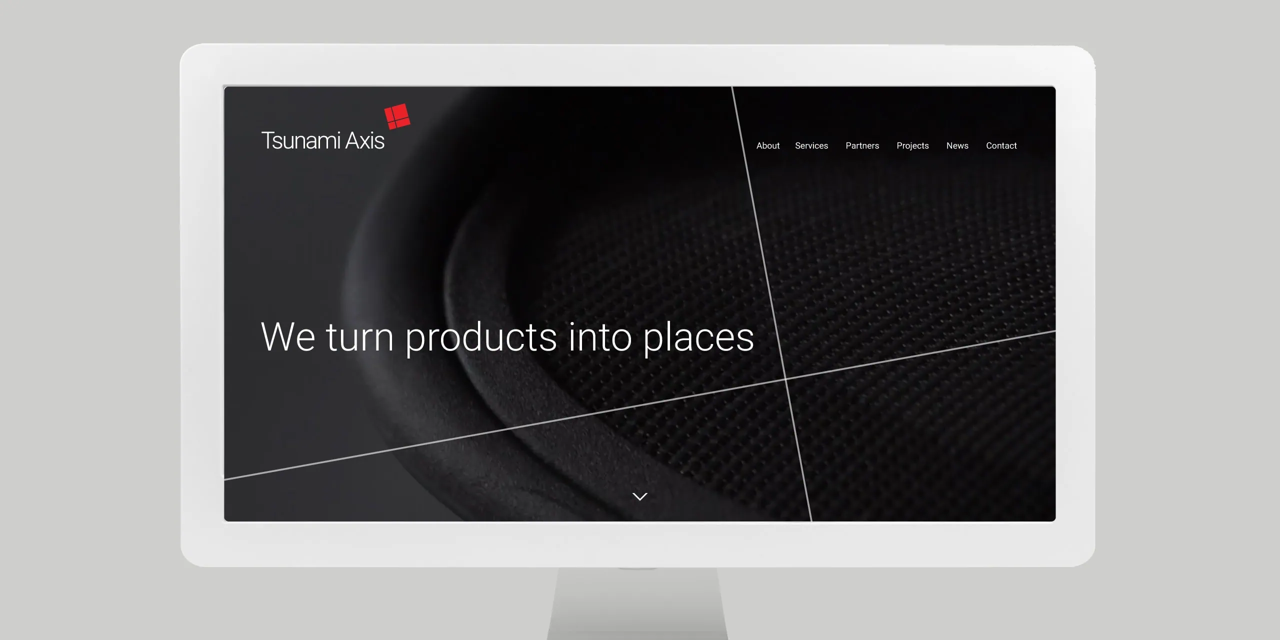
Our brief was to create a ‘cool, minimalist’ design, which captured Tsunami’s brand and the quality of their products. The UX design also had to meet a complex range of different user needs.
UX Web design
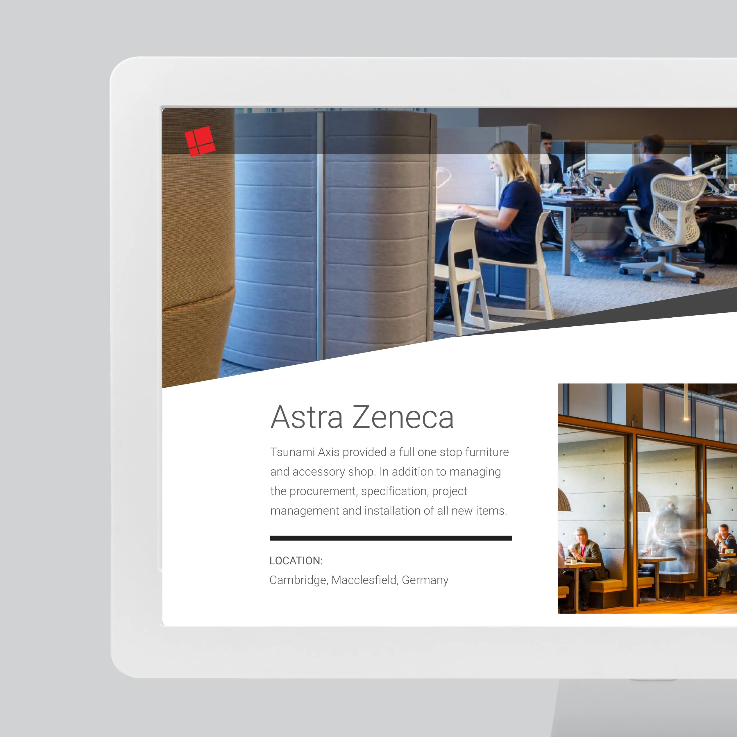
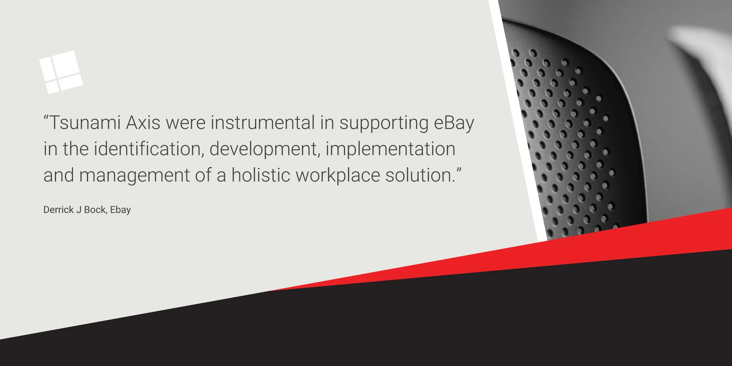
Our design is closely aligned to the distinctive Tsunamis Axis brand. We evolved a look and feel inspired by their existing logo and developed the brand palette of red, grey and black. Key design elements include bold use of angular shapes, sharp lines and animated hover effects that reflect the Tsunamis Axis logo.
Imagery was crucial to the design. Priority is given to the client’s stunning collection of workplace imagery, to showcase their impressive range of work. In the work area, vibrant imagery conveys the quality, creativity and scale of each project. Pared back copy provides users with key information at a glance. Elsewhere, we used abstract imagery to meet the minimalist brief. These images combine with a parallax effect to create depth and movement.
Web development
As always, we balanced the creative elements of this project with in-depth technical planning and development.
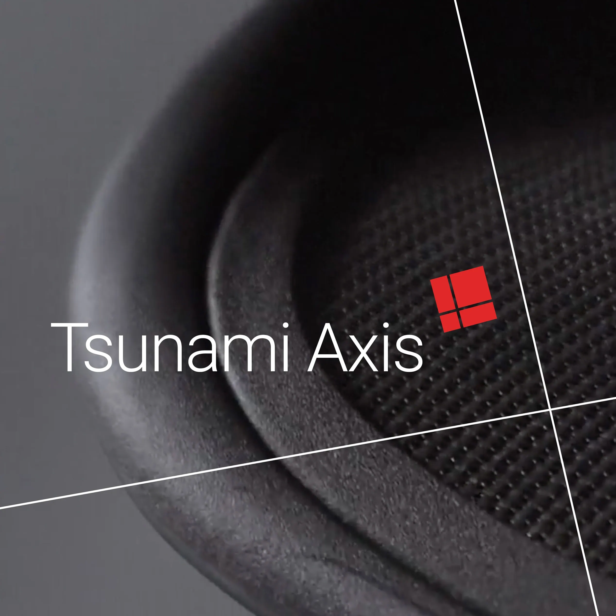
The site is built for speed and performance. We used several techniques to improve loading times – for example, animations such as the splitting ‘axis lines’ on the home page are built using code, instead of images.
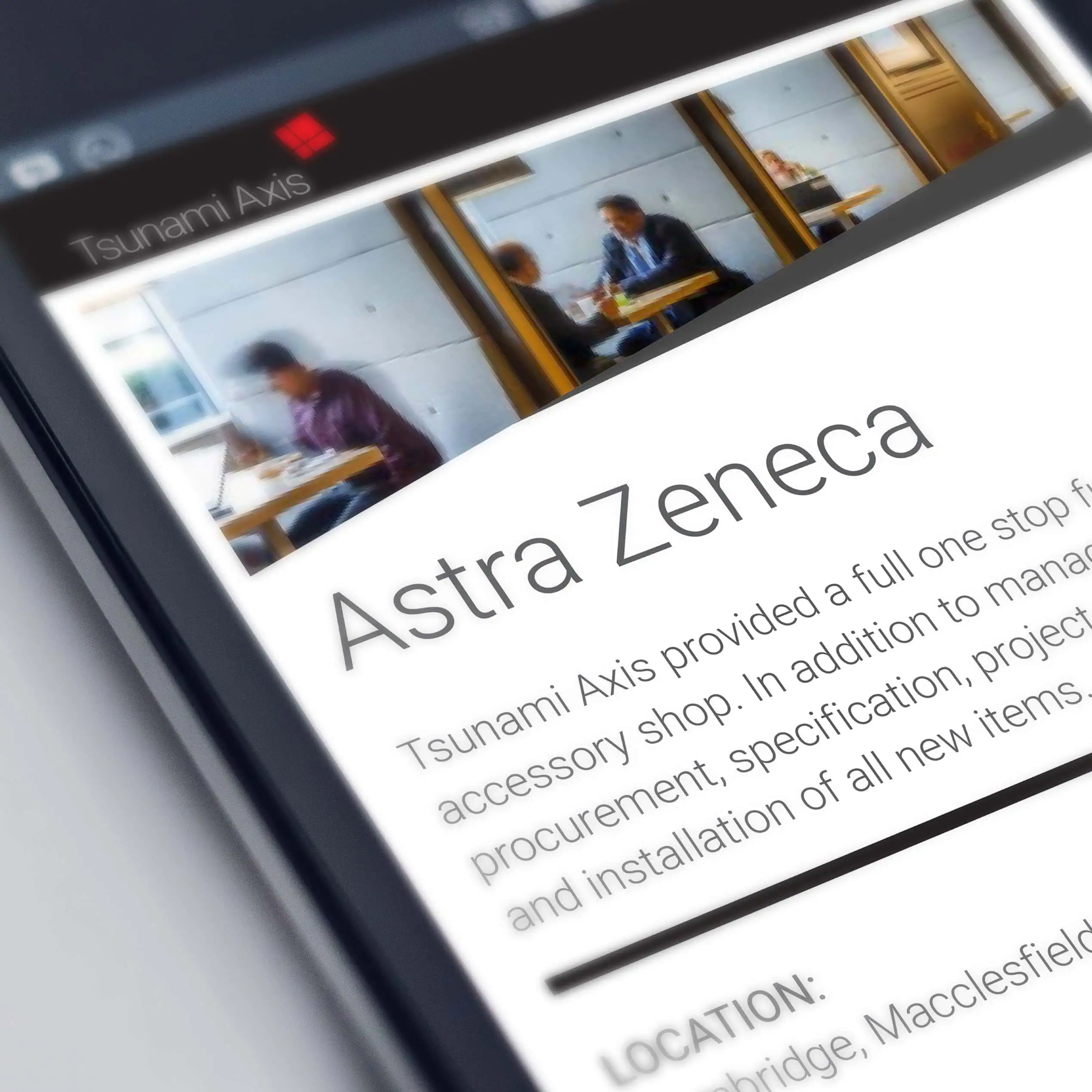
As part of developing a responsive website, we improved load speed by serving up appropriately sized images, to suit each device type.
What our client said
Working with Union 10 Design was a pleasure. They had the flair, creativity and development skills to create a truly unique website for us. They not only understood our brief, they also made a point of understanding our business, working collaboratively to ensure the site’s structure, content, design and functionality was cohesive and right, for both for our company, and our clients.
Lee Smith // Tsunami Axis