# Innovative recruitment web design

Red10

Recruitment – but not as you know it: moving beyond the grey suits of recruitment

01

Insight

Red10 is a leading, specialist recruitment agency in the insurance and asset management sectors. We were briefed to transform their digital brand with a new website.

Working closely with Red10, we developed a recruitment web design that conveys a fresh brand identity, as well as providing an intuitive user experience for candidates and employers.

02

Branding

The branding brief was succinct, direct and challenging. Red10 required a fresh digital brand that was innovative for their sector. They asked us to move beyond the ‘grey suit’ image of recruitment, to create a digital brand that competitors would aspire to.

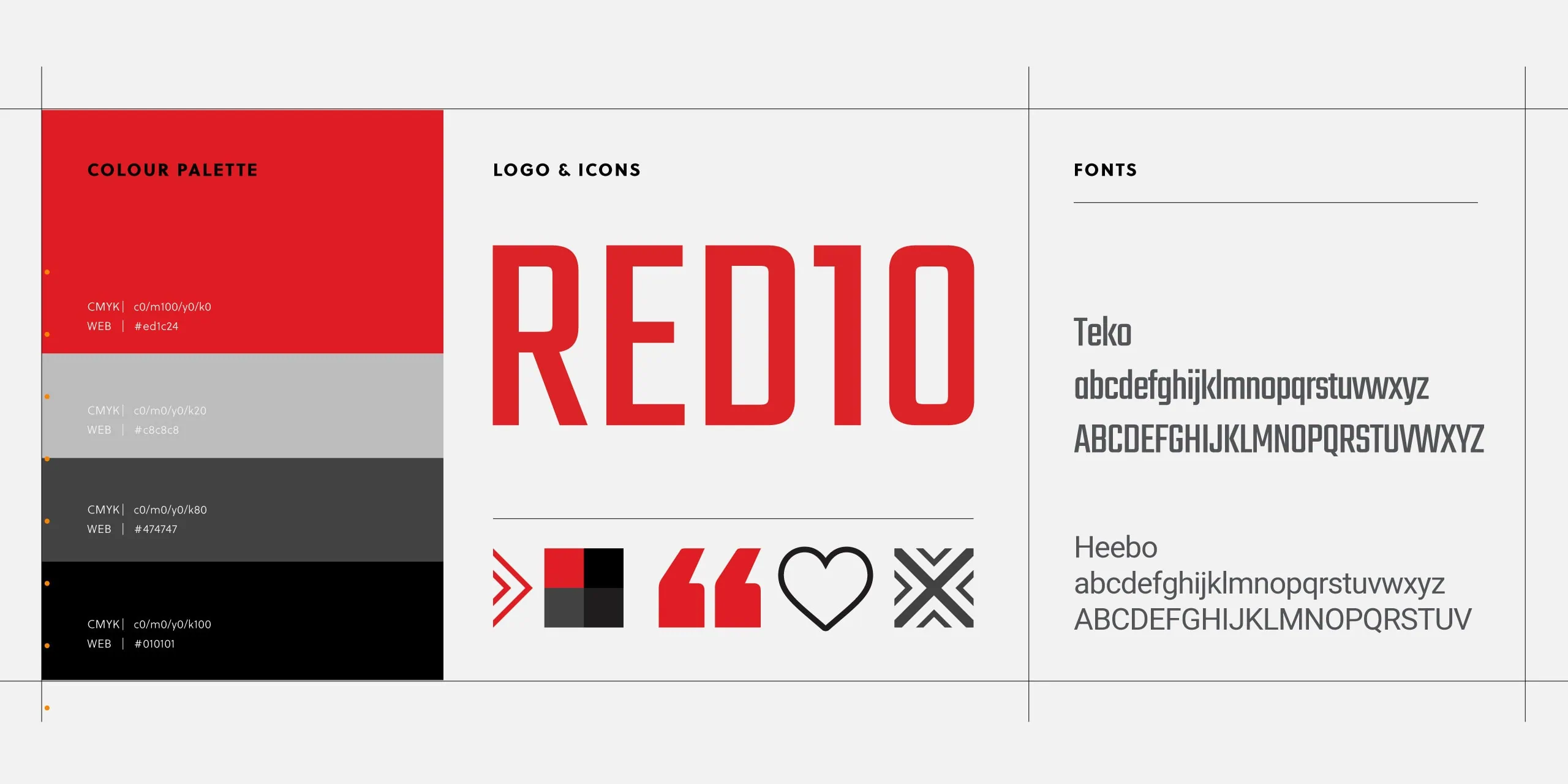
We developed a restricted colour palette (red, black and white), a typeface and logo design that conveys the direct nature of the Red10 brand – straightforward, honest recruitment.

To ensure consistent use of the new brand identity in the future, we provided brand guidelines to the client.

02

Web design

Our recruitment web design expands on the new brand identity, by adding elements such as the arrow and target iconography. Simplicity was key and all unnecessary design elements were pared back to create a look and feel that’s bold and distinct.

To move beyond the ‘grey suits’ image, we selected diverse, high-quality imagery placing ‘real people’ at the heart of the Red10 brand. Vibrant and engaging was the order of the day – dull, clichéd images need not apply! By combining bold design with captivating imagery, the new website pushes boundaries in the field of recruitment.

We also introduced texture and movement to the site to creatively to enhance the brand. On the Homepage hero, a subtle animation quickly engages the user with key elements of the brand. Another example can be seen on the Jobs page, where square blocks animate and each section of text loads gradually.

What our client said

The website transformation can be seen positively in the analytics. Comparing Q1 2017 to Q1 2018, there are 85% more users and 1068% more job applications through the website which is fantastic. Pages per session increased, which also shows higher engagement, so again really positive.

Joanne Flint // Red10

03

Web development

Red10’s primary goal was to engage with potential candidates and employers online. Our responsive, WordPress site was developed to offer a seamless user journey.

For candidates, accessing the latest jobs is intuitive and quick. For employers, the services section outlines how Red10 delivers value to each specialist sector.

We integrated Broadbean (a job listing site) into the site, which has saved Red10 time, as jobs are now automatically added and updated on the site.

We also paid close attention to technical functionality, optimising the site for performance and speed by serving up different image sizes depending on screen size and the use of sprite sheets to minimise the number of HTTP requests.

Delivering a truly responsive design was also a challenge. Design elements had to transform elegantly and consistently to work effectively across all platforms. For example, the directional arrows on the Meet the Team page automatically change direction to fit the context of the user’s screen size.

04

Support and maintenance

As well as delivering WordPress training to familiarise Red10 staff with the content management system, we also provide ongoing support and maintenance.


Date Completed // April 2017


// Share this page

05

Related Projects