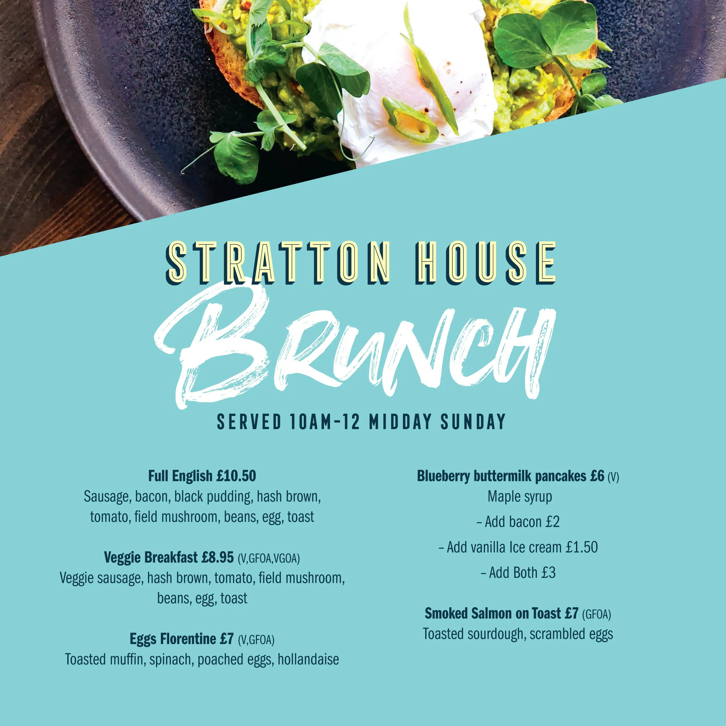
Restaurant Logo Design
The importance of design
Choosing your restaurant logo is one of the most important decisions you’ll make for your business. Your logo and, more widely, your branding will shape you how potential customers will perceive you.
Your logo design should reflect your style of cuisine, location and customer base.
Whether rustic, modern, playful or classically stylish, it should be clearly defined and memorable.
Your branding is the visual identity that your customers will connect with and recall when they find you online, in an advert or pass your sign in the street. So, it’s important your logo has stand-out and is instantly recognizable.
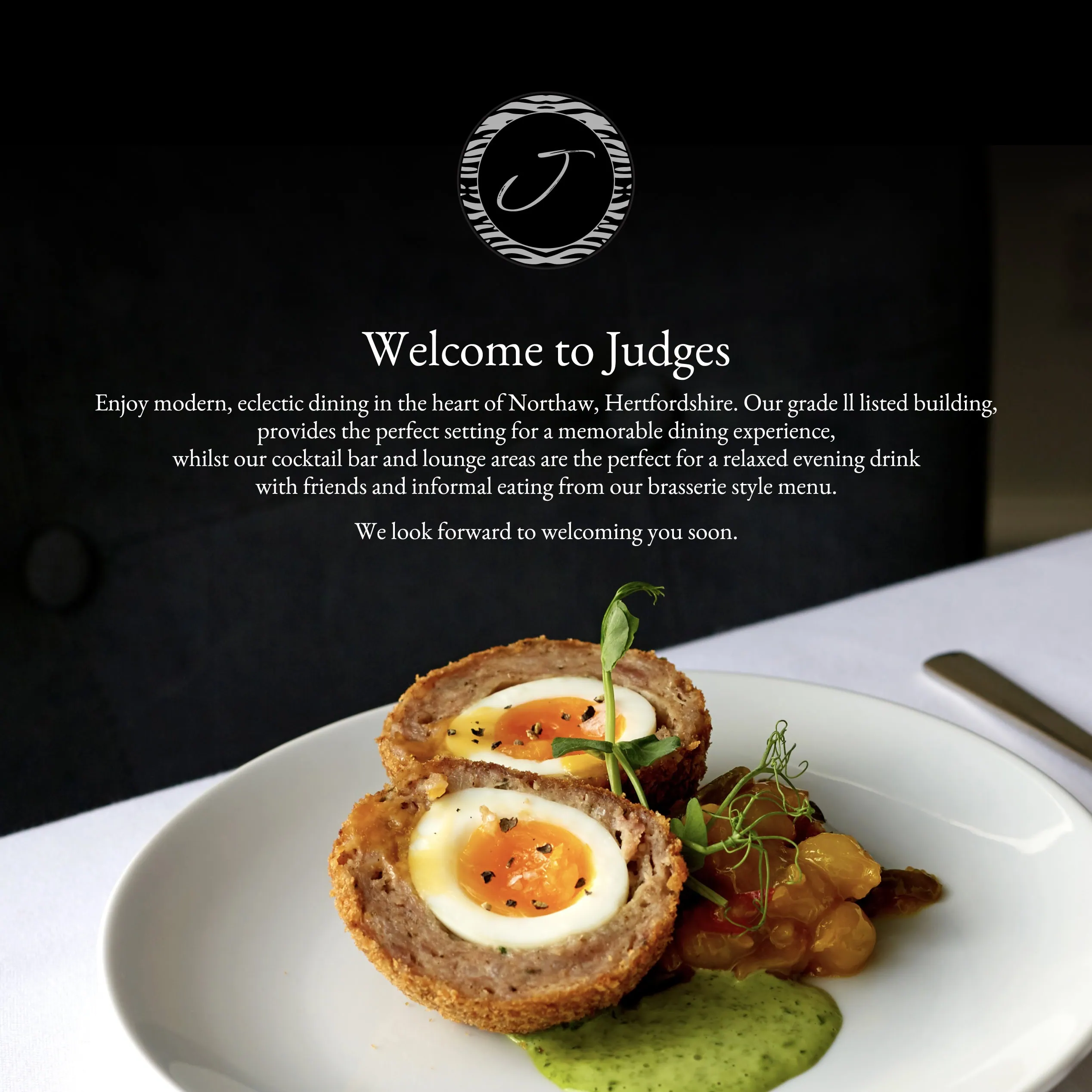
So, what makes a good restaurant logo?
When considering any logo design, you should think of the wider picture of your branding design as a whole.
But first, let’s clear something up. A logo is a symbol or word(s) that acts as an identifier for your business. Branding is a collection of elements (including your logo) that collectively build an image of a business for its consumers. For example: fonts, colour palette, strap lines, tone of voice, style of imagery, graphic design style across all media.
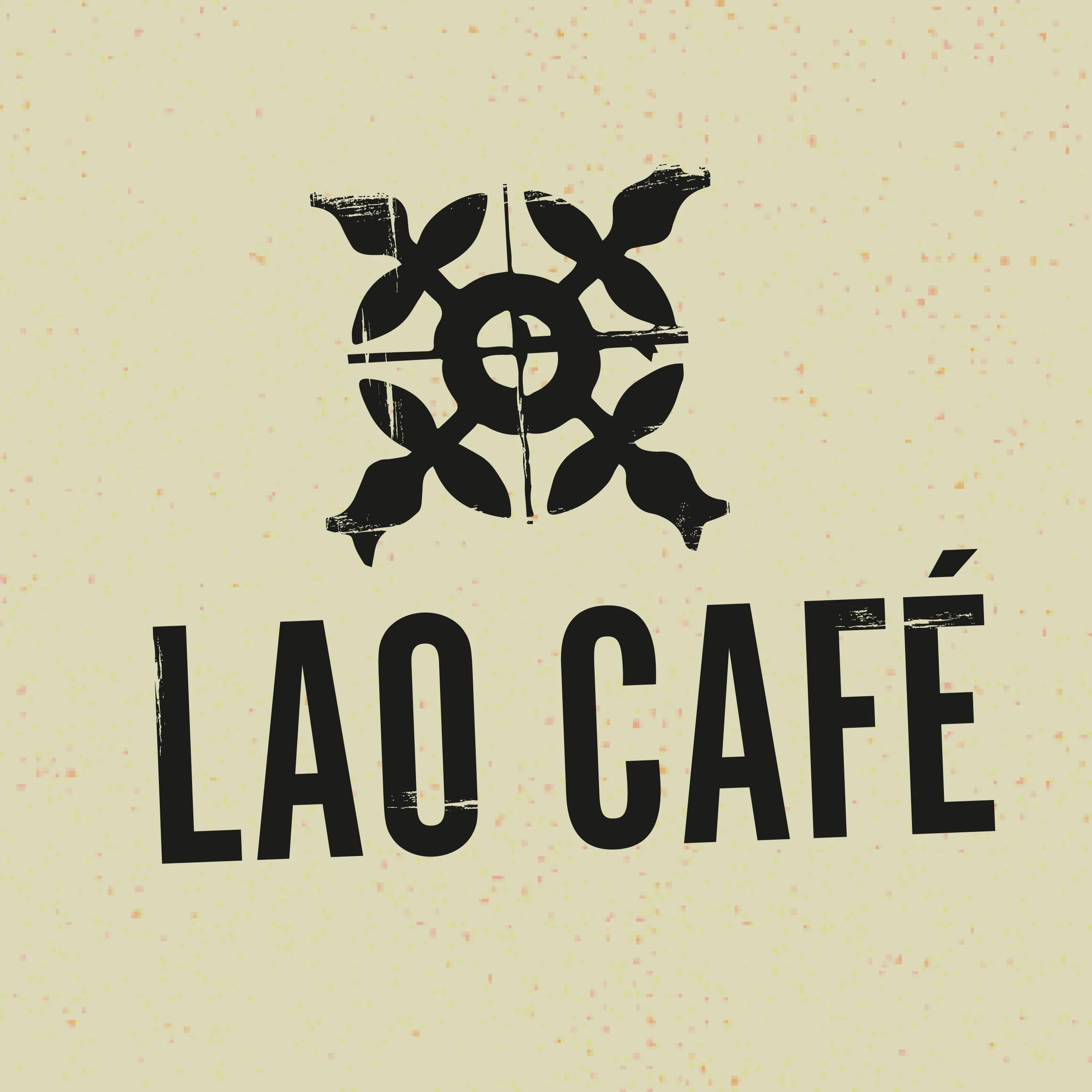
Examples of restaurant logos
A well-designed logo should be adaptable to use across multi-platforms. It should be legible at any size, whether a small monogram on a delivery app, a vinyl wrap on a van or an embroidered motif on an apron. It should work in black and white and colour, in RGB for web and CMYK for print. It should stand the test of time rather than merely follow the latest design fad.