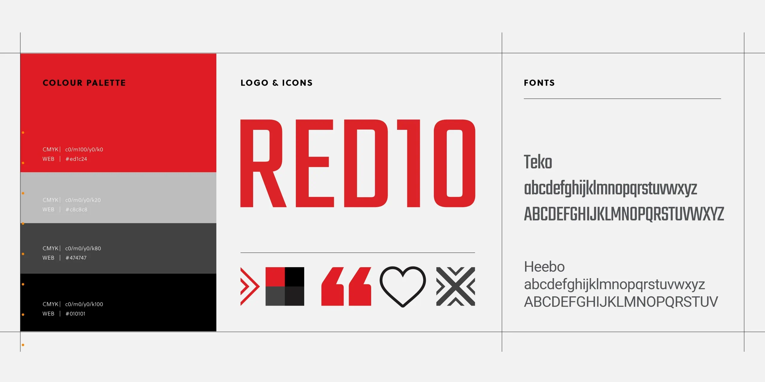
# Thai restaurant website design

Rosa’s Thai

Authentic, inspiring Thai restaurant website design with compelling user experience.

01

Insights

Rosa’s Thai began as a street stall on Brick Lane’s Sunday market in the East End of London. They opened their first Thai restaurant in 2008. When Union 10 first started work with Rosa’s in 2014 they had four restaurants. As of 2022, Rosa’s Thai can be found throughout London and are expanding across the UK.

They required a user-led, engaging website to support and enhance their rapidly expanding brand. We created an agile website that allowed Rosa’s to create content quickly and easily as their business evolved.

This latest update of the website was initially triggered by a brand refresh. However, whilst we had the opportunity to review the site, we were able to refocus and apply the very latest in web development and functionality.

02

UX research

Our initial research stage allowed us to focus on the customer journey and gain insights into site performance and User Experience (UX).

Using Google Analytics, we could identify areas of the current website that were performing well and pin-point pages that needed revisiting.

We undertook competitor analysis, looking at other Thai restaurant websites, large chains and smaller independents. By evaluating their customer journeys, we identified what worked well and what didn’t. With these insights we created a wireframe where we could test user experience including internal linking, call-to-actions, and content.

03

Website design

From one perspective the design phase was led by the brand refresh, with a Thai-inspired vibrant colour palette and bold new font. Whilst Rosa’s aspire for business growth, they don’t want to appear as a large chain, they want to retain their independent brand identity and their Thai roots.

Working with the freedoms bespoke web development allows, we were able to be creative with the design style, producing an inspiring and visually engaging website. We used the brand assets throughout the site: the Rosas doily and textured backgrounds.

However, in web design, freedom requires restraint. Overuse of large imagery and video can impede site speed. So, assets were designed and optimised to ensure uploads were as small as possible.

From another perspective the design was led by UX. As most users will be viewing the site on their phones, we adopted a mobile-first approach to the design. we used Google’s mapping API to serve up location results based on the user’s locations.  They can then see how close locations are to them, book a table, get directions from Google maps. Call or go and find out more about the restaurant.

The site is responsive, meaning it works seamlessly across all devices. This meant ensuring important content is displayed ‘above the fold’ (before a user needs to scroll) on all devices: desktop, tablet and mobile. We also ensured call-to-action buttons were placed in strategic places to ensure users had easy access to book a table, find a location, view the menu and other important links.

04

Web development

The brief prioritised site management alongside UX. Their busy marketing team needed be able to work as efficiently as possible, as well as consistently. They already had a good understanding of WordPress Content Management System (CMS), and we worked closely with them to customise the CMS to their specific needs: from day-to-day communication, to managing their expanding portfolio of restaurants.

They needed to be able to:

  • Add new restaurant locations without any developer knowledge, including booking widgets, adding Google reviews, managing restaurant announcements.
  • Update menus and create seasonal menus.
  • Have flexible page layouts, so they create landing pages for seasonal events.

Global options

Another time-saving piece of CMS functionality was the use of Global Options. This means creating a central location within the CMS for settings that are used globally throughout the website. This not only saves time, but also ensures consistency and avoids errors. For example, if you have multiple links to an Allergen Information PDF which you want to update, you must remember to update all the links throughout the site. With this set as a Global Option, you only need to update the link once.

Our global options included:

  • Restaurant opening hours. 80% of Rosa’s locations have the same opening times. So, by default we set all locations as the global opening hours, which could then be overwritten if required.
  • Global URLs for Delivery, Click and Collect and default booking widget. Meaning, for example, a single change to the Deliveroo URL would change it everywhere across the site.
  • The Scrolling Banner advertising seasonal events.  This is used on many locations throughout the site, having the banner content controlled in one area means a single update populates the whole site.
  • Allergen information is an important requirement for restaurants, so having one place to manage this document is very important.

Menus

Food menus are a basic requirement for any restaurant website. Some websites have these as PDF downloads. But, to do this is a mistake, as you will miss out on vital Google search opportunities, as well as having a menu that is indecipherable on mobile. In addition, you can’t filter a PDF.

We included Rosa’s Thai menus within the CMS and gave great attention to their UX. The user can filter the menu by:

  • Location prices — London and regional prices.
  • They can show calories — a legal requirement for some restaurants.
  • They can filter dishes based on dietary requirements; in this case vegan and gluten free.


05

Technical SEO

Union 10 include technical SEO as part of our website services. This includes:

  • Core Web Vitals
  • Site Speed
  • XML sitemaps
  • Meta Data
  • Next-Gen image formats
  • Mobile First
  • SSL certificate
  • Schema Markup can also be added to relevant content

Schema Markup for restaurants

A major requirement for this site was to implement Schema Markup. Schema is used to signpost important information to search engines (such as Google), so they can clearly understand important information.

Schema markup for restaurants includes:

  • Locations: name, opening hours, address, phone number, price range, accepts reservations and cuisine type.
  • Recipes: cuisine type, name, prep and cook time, description, image, ingredients, instructions, yield and categories.
  • Menus: dish name, description, price, nutritional information and image.
  • FAQs: question and answer.

Optimising for these means your website pages have the potential to show up in Google’s rich search results and therefore boost rankings. We coded this into the website, so it’s automatically added without the client having to do anything.

Find out more about Union 10’s SEO Services or read our blog post, The Ultimate Guide to Professional SEO.

05

Training

As always, we provided comprehensive training for the client so they could manage the site with confidence!

Find out more about website design for restaurants, read The Ultimate Guide to Restaurant Website Design


Date Completed // October 2022


// Share this page

#

Related Projects